Assignment 02b: Mapping Values and Categories (with raster data)
Due: October 14, 2020
Assignment 02 Deliverables
To receive credit and feedback on this project please upload the following to canvas by 10/14.
From Assignment 02a:
Three designed map compositions, which include key map elements (legend, scale bar, north arrow). These should be designed and your aesthetic choices should support readability and clarity in the maps:
- Absolute number of rental housing units, symbolized with natural breaks (Jenks)
- Dot density of rental housing units (choose a value of dots per housing unit that produces a legible map)
- Rental housing units normalized by total housing units, symbolized with natural breaks (Jenks)
In 1-2 paragraphs discuss:
- Based on these three maps discuss which areas in Newark have the most rental housing units. On which map are you basing this conclusion? Does each map tell the same story? If not why not? Interpret the differences between each map based on our discussions of classification and symbology.
Assignment 02b part 01:
- a screenshot of your map depicting population change since 2000 with New Jersey counties overlaid
- answer to our research question: Where has the population decreased between 2000-2020 in New Jersey? (In the form of a list of the counties which have experienced population loss since 2000)
Assignment 02b part 02:
Download a different landsat scene for some other area (perhaps where you are from, a location you are working on for studio, the main point is that it should be somewhere you are interested in and know something about. Read about false color combinations here and choose a false color composite to highlight some aspect of that location. The false color composite should be chosen so that it supports a visual narrative about that place – for example you might choose a composite that makes urban areas very bright or that shows agricultural areas very clearly.
Create a map composition that includes a title (indicating the location), scale bar, and north arrow.
Please submit:
- one .pdf file with all five maps required in this assignment:
- three maps of renters in Newark, one per page
- screenshot of population change map
- false color composite of an area of interest
- one .txt file including your responses to each of the above questions
Data download
All data for Assignment 02b is available for download here
Part 01: Raster Math & Population Change
In part one you will be introduced to basic operations with the raster calculator to find the difference between two raster datasets.
In this example we will investigate population change between 2000-2020 in the New York Metropolitan region using the Gridded Population of the World data set produced by Columbia University’s CIESEN. More information about this dataset and the methodology behind its creation is available here.
In the next simple steps we will answer the research question:
Where has the population decreased between 2000-2020 in New Jersey?
Open QGIS.
Add the three raster data sets inside the 02_mapping_values/part_b_data folder to your map.
gpw_v4_population_count_rev11_2000_30_sec_clip_NY.tif and gpw_v4_population_count_rev11_2020_30_sec_clip_NY.tif are portions of the Gridded Population of the World (GPW) clipped to the NY metro region to reduce file size and facilitate easier processing for this tutorial.
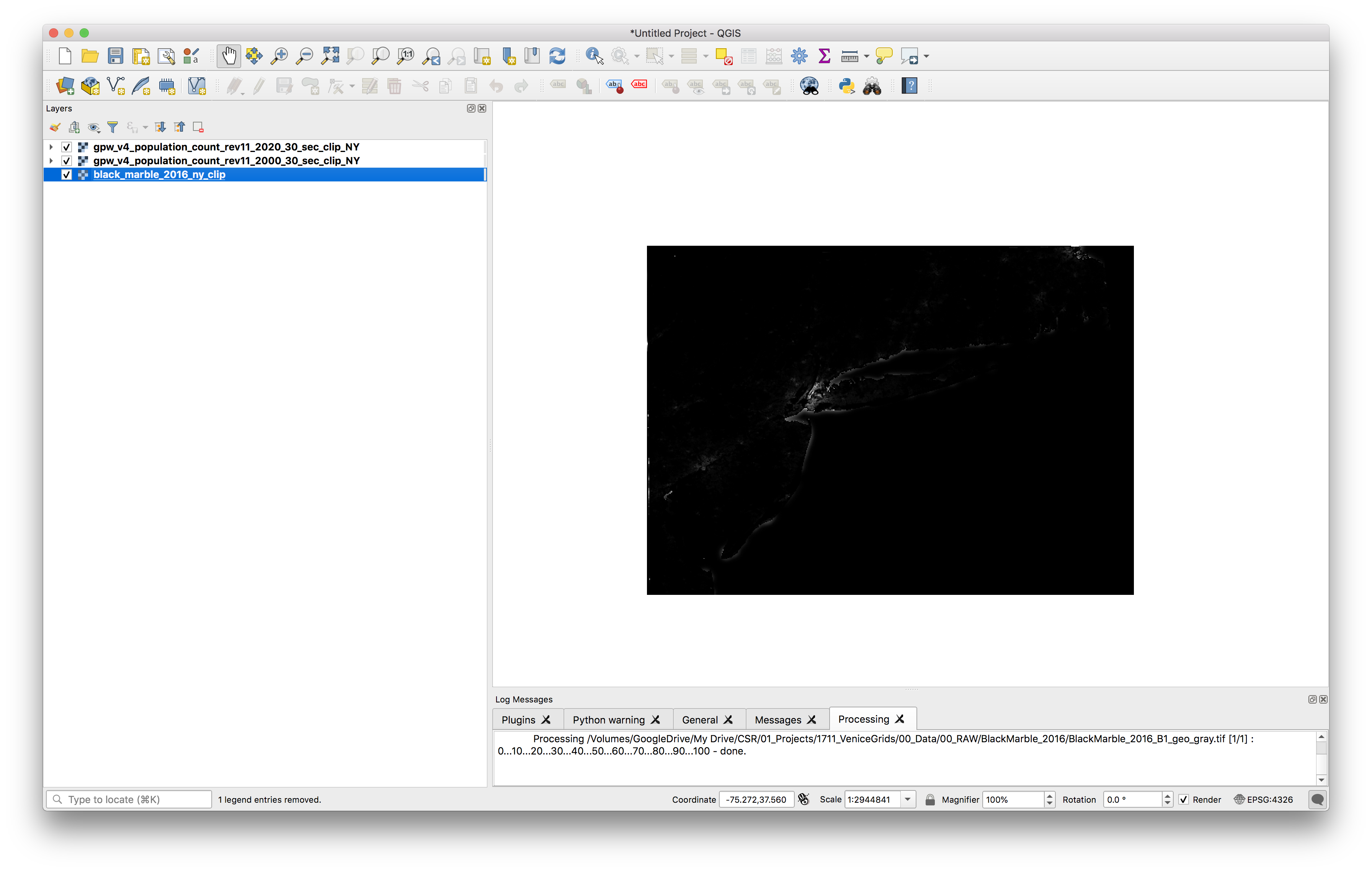
black_marble_2016_ny_clip.tif is a clipped version of the Black Marble remotely sensed image produced by NASA which served as the second input layer from the In Plain Sight film that you watched as an assignment for today. This is included just for reference and because it is beautiful. This dataset and others is available from NASA here.
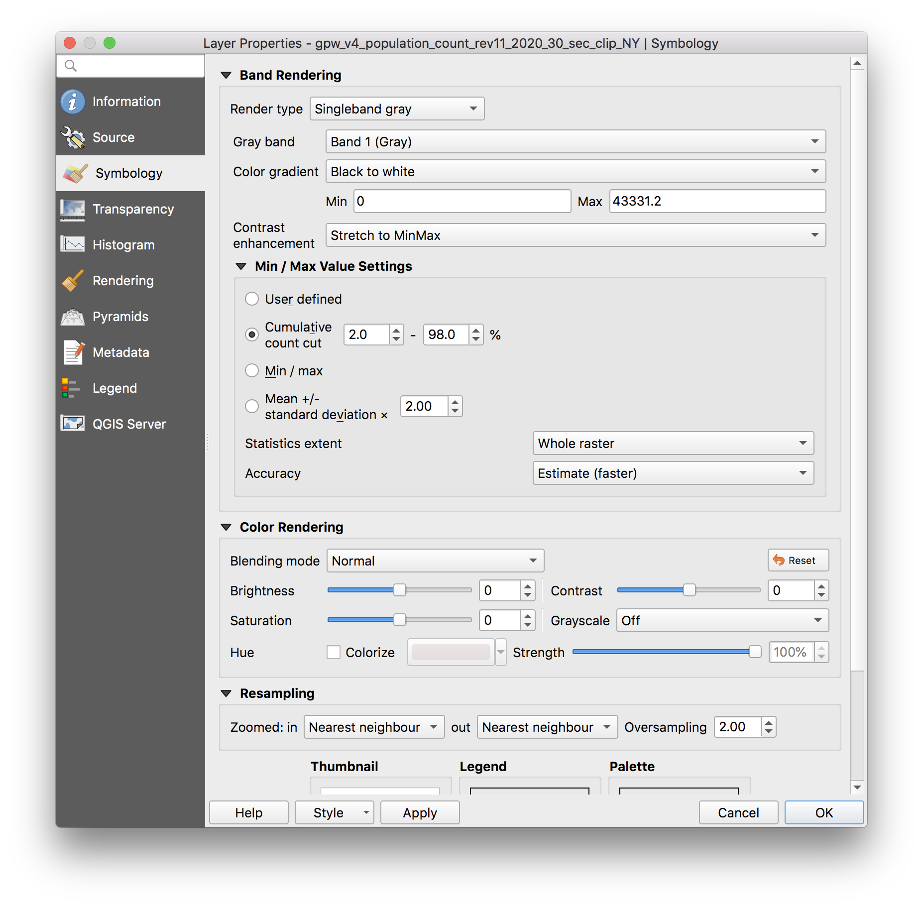
To be able to more clearly view the range of population values for the GPW datasets open the Layer Properties menu for one of the two GPW layers. In the symbology tab make exactly the selections shown below. Make sure to expand the Min/Max Value settings options and select cumulative county cut with the minimum at 0% and the maximum at 98% this means that you are stretching a color ramp from the lowest value in the dataset to the 98% greatest value. In other words we do not visualize the outliers at the top end of the data set so that we can have more visible variation in what we are drawing on the map.
After you make these selections the GPW dataset should look more like this:
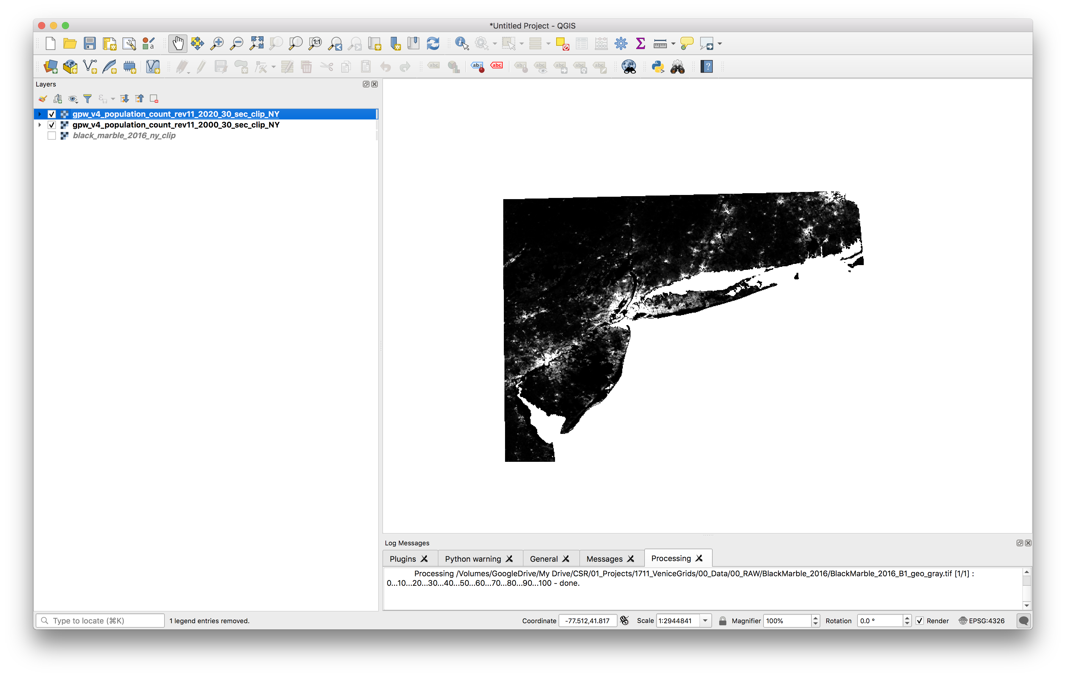
Repeat the last step for the second GPW dataset and toggle the visibility on and off between the two to see if you can notice any differences between the two layers: see if you can notice any differences in the population between 2000 and 2020.
Next we will perform the analysis to answer our research question: Where has the population decreased between 2000-2020 in the New York Metro region?
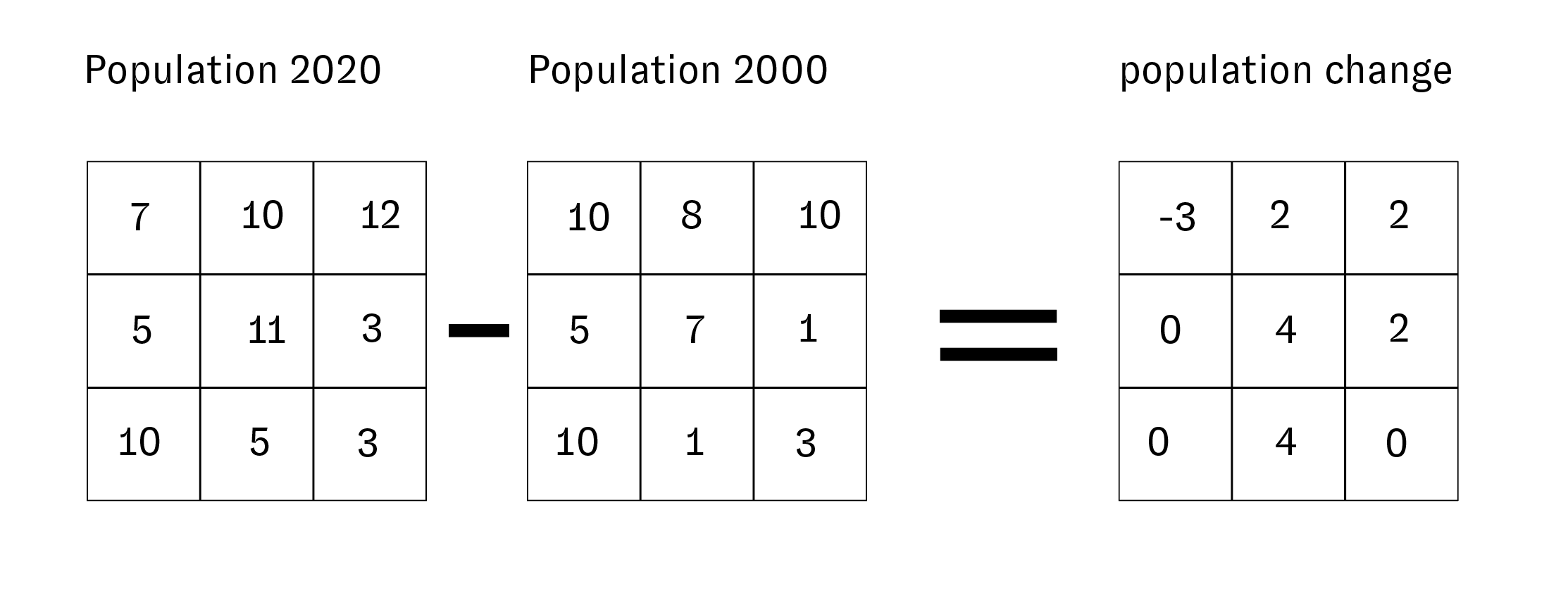
Remember, raster datasets are comprised of a grid of cells where each cell has precisely one value. In the example datasets here that value corresponds to the total estimated population for the 1 square kilometer on the earth’s surface represented by each cell.
To find where population has decreased between 2000 and 2020 we can subtract the value of each cell in the 2000 dataset from the corresponding cell in the dataset from 2020. The cells which have negative values will correspond to places which lost population between 2000 and 2020. This subtraction is called raster math.
When you subtract one raster dataset from another the result is a new raster dataset which contains the results of the subtraction. Diagrammatically it works like this:
To be able to perform this type of analysis the cells of the two rater datasets you are using must be same size and exactly aligned with one another. In this example because we are using two datasets from the same source/series this is not an issue, they are already aligned. If you are using two raster datasets from other sources you may need to realign and / or resample the dataset as a pre-processing step. See further information about how to do this in QGIS here
To do this raster subtraction we will use a tool called a raster calculator. Open this using the Raster tab on the top menu and select Raster Calculator.
Click the ... button circled below to specify where you will save this new raster dataset. Create a new folder called raster_processing within the folder for this assignment and then specify the file name for the new subtracted raster: gpw-v4-population-count-sub-2020-2000.tif. Then double click the band names for the 2020 and 2000 population rasters.
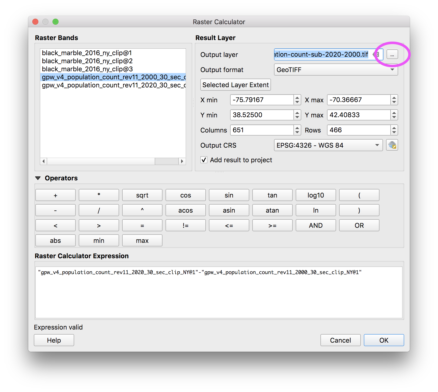
A note on vocabulary: a single raster dataset can have multiple ‘bands’ – as a way of storing multiple values for a single grid cell. This is how digital images work: each pixel in a digital image has a Red value, a Green value and a Blue value (RGB) when these bands are visualized together their combination shows us the color of an image.
The results of your subtraction will look something like this.
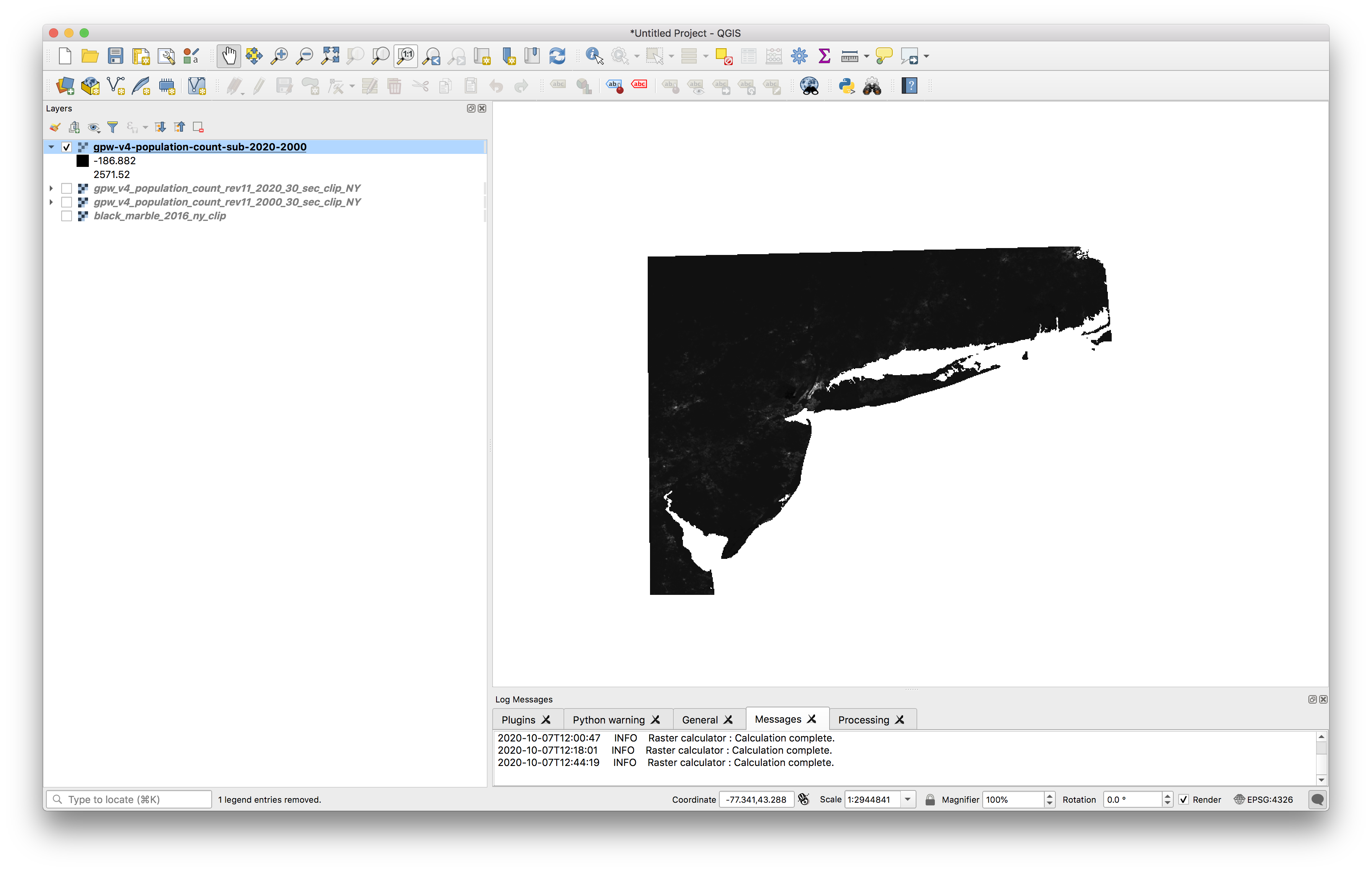
The way that it is currently visualized it is challenging to tell which areas gained population (have positive values) and which areas lost population (have negative values). Now we will change the symbology of the raster to be able to more fully see the variations.
Open the layer properties for the new raster dataset you just created and make the following selections exactly:
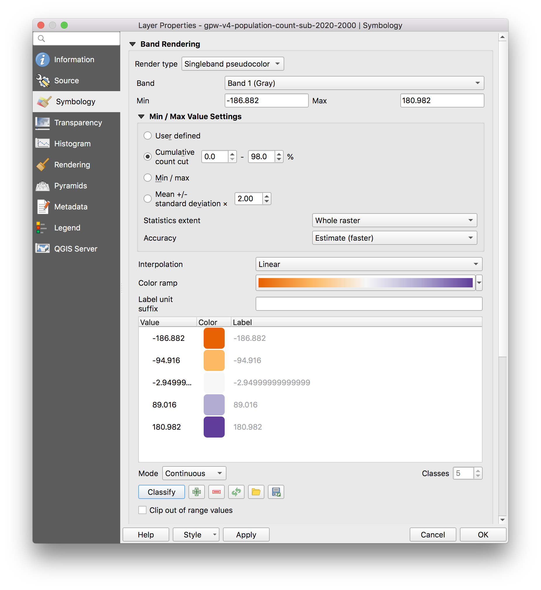
Click Apply and OK and the results should look something like this:
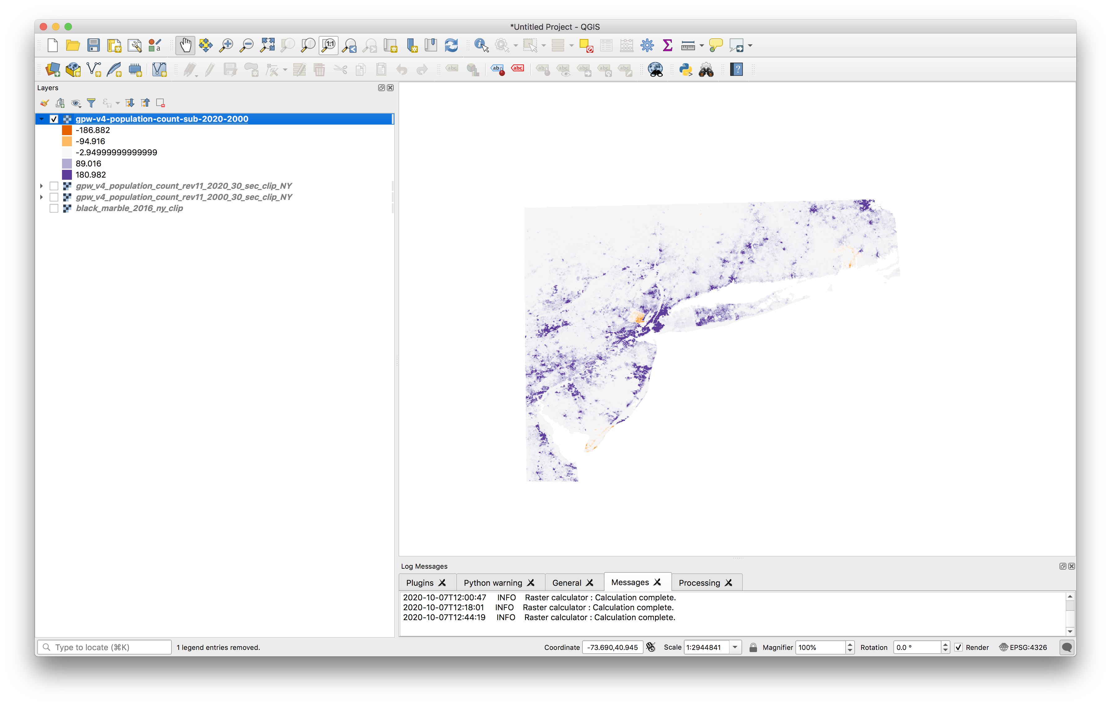
Download a shapefile of New Jersey county boundaries here and add them to your map. Which two counties seem to have experienced population loss since 2000?
For feedback and credit on Assignment 02b part 01 turn in:
- a screenshot of your map depicting population change since 2000 with New Jersey counties overlaid
- answer to our research question: Where has the population decreased between 2000-2020 in New Jersey? (In the form of a list of the counties which have experienced population loss since 2000)
Part 02: Satellite Imagery
This portion of the exercise will introduce you to multispectral satellite imagery, and to the process of visualizing phenomena through ‘false color composites’. As an introduction we will create false color composites using Landsat satellite imagery of Puerto Rico captured just before and after Hurricane Maria (on September 17 2017 and October 3 2017).
After completing this exercise you will:
- have familiarity with basic characteristics of multispectral satellite imagery
- learned how to acquire Landsat satellite imagery through the U.S. Geological Survey
- created a false color composite from multispectral Landsat dataset
Some Background on Working with Landsat Satellite Imagery
Multispectral satellite imagery refers to a type of data that records specific wavelength ranges in the electromagnetic spectrum. In the case of the Landsat program, the Landsat Satellite has sensors that are able to detect light waves beyond the visible light spectrum (both near infrared as well as ultra violet frequencies). Specific frequency ranges are each recorded in a distinct band.
A single Landsat ‘image’ is actually composed of multiple bands. Each band is an individual raster dataset where the value of each pixel corresponds to the wavelength of reflected light captured by the satellite. These datasets are stored as individual .tif files which appear as monochromatic images when we load them in QGIS individually.
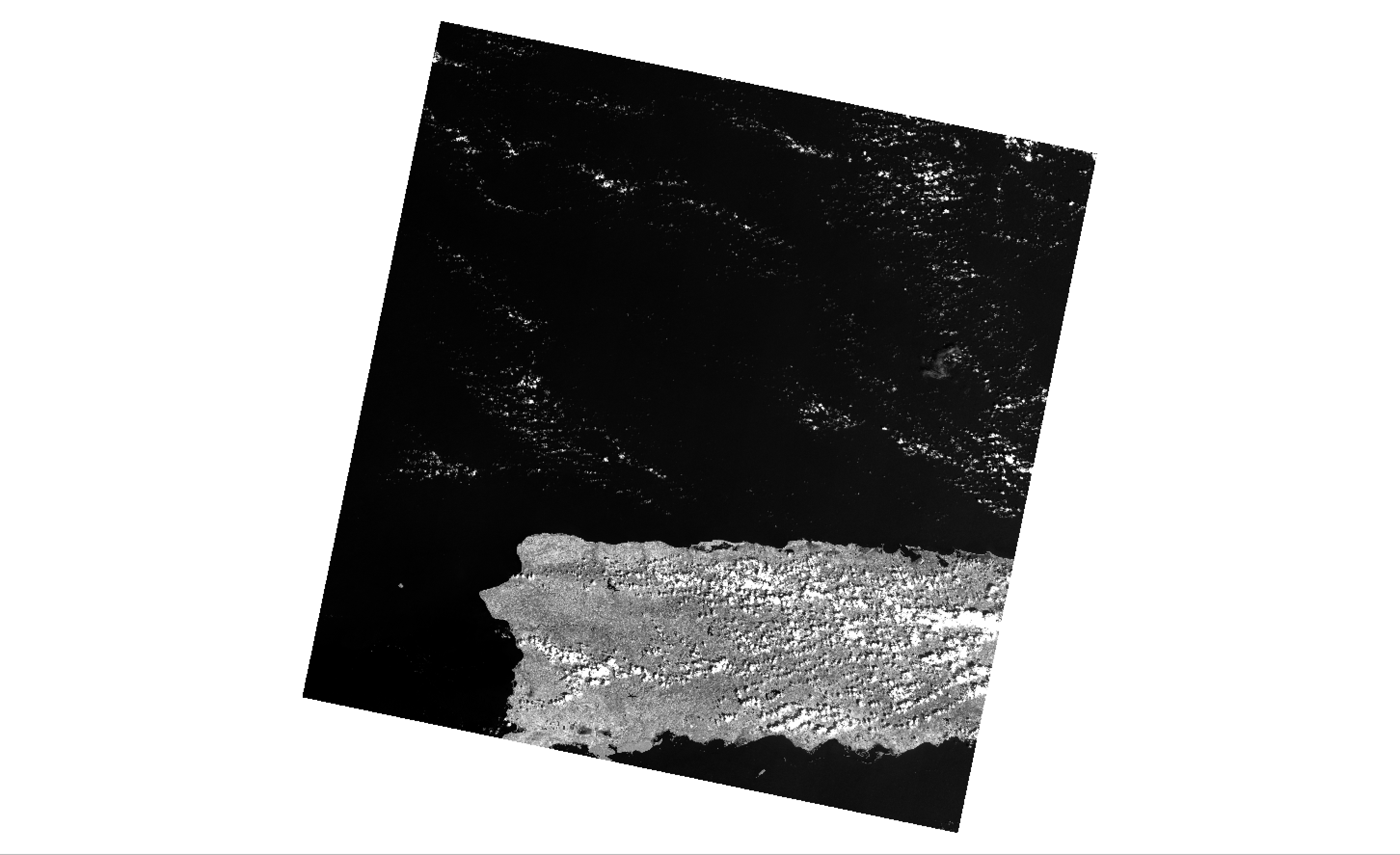
For example the image below shows band 5 from a Landsat 8 satellite image captured of the western portion of Puerto Rico on October 3, 2017:
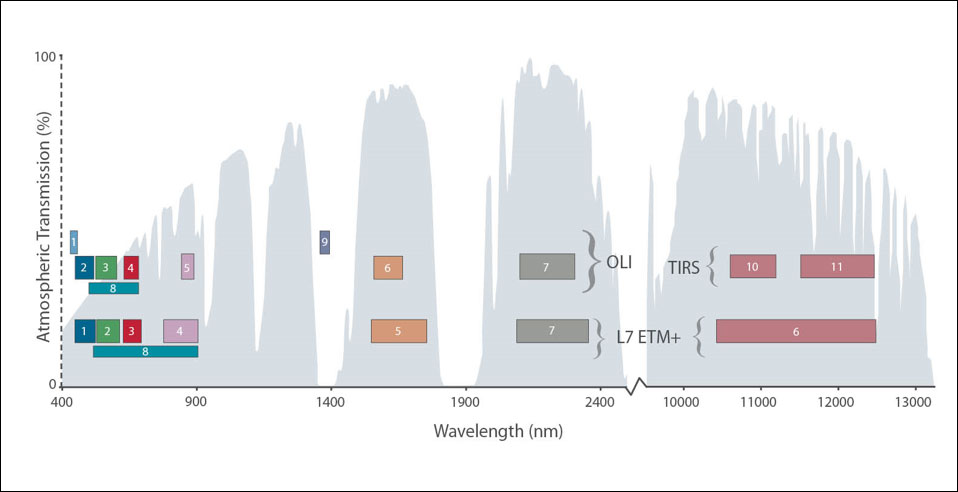
This image shows wavelengths along the electromagnetic spectrum as well as the ranges that are captured by each Landsat band.
The field of remote sensing science is dedicated, in part, to understanding the different ‘spectral signatures’ of features on the earth’s surface. In other words, what frequencies of light in the electromagnetic spectrum do various types of vegetation reflect? Do certain types of man-made surfaces reflect more ultra violet light? Does healthy vegetation reflect greater or less light in the near infrared range than vegetation in drought conditions?
From the answers to these questions researchers study topics like landscape change, ecological vulnerability, and large scale urban development.
One of the ways that remote sensing scientists study these ‘spectral signatures’ is through creating color composite images using multiple of the monochromatic bands from multispectral imagery. This is a method by which each band is assigned a color (red, green, or blue) and its values are mapped onto an RGB color scale. We can make color composites that approximate a ‘natural color’ image of the earth’s surface. Or we can combine different frequency ranges from the electro magnetic spectrum into false color composites to reveal different phenomena on the ground.
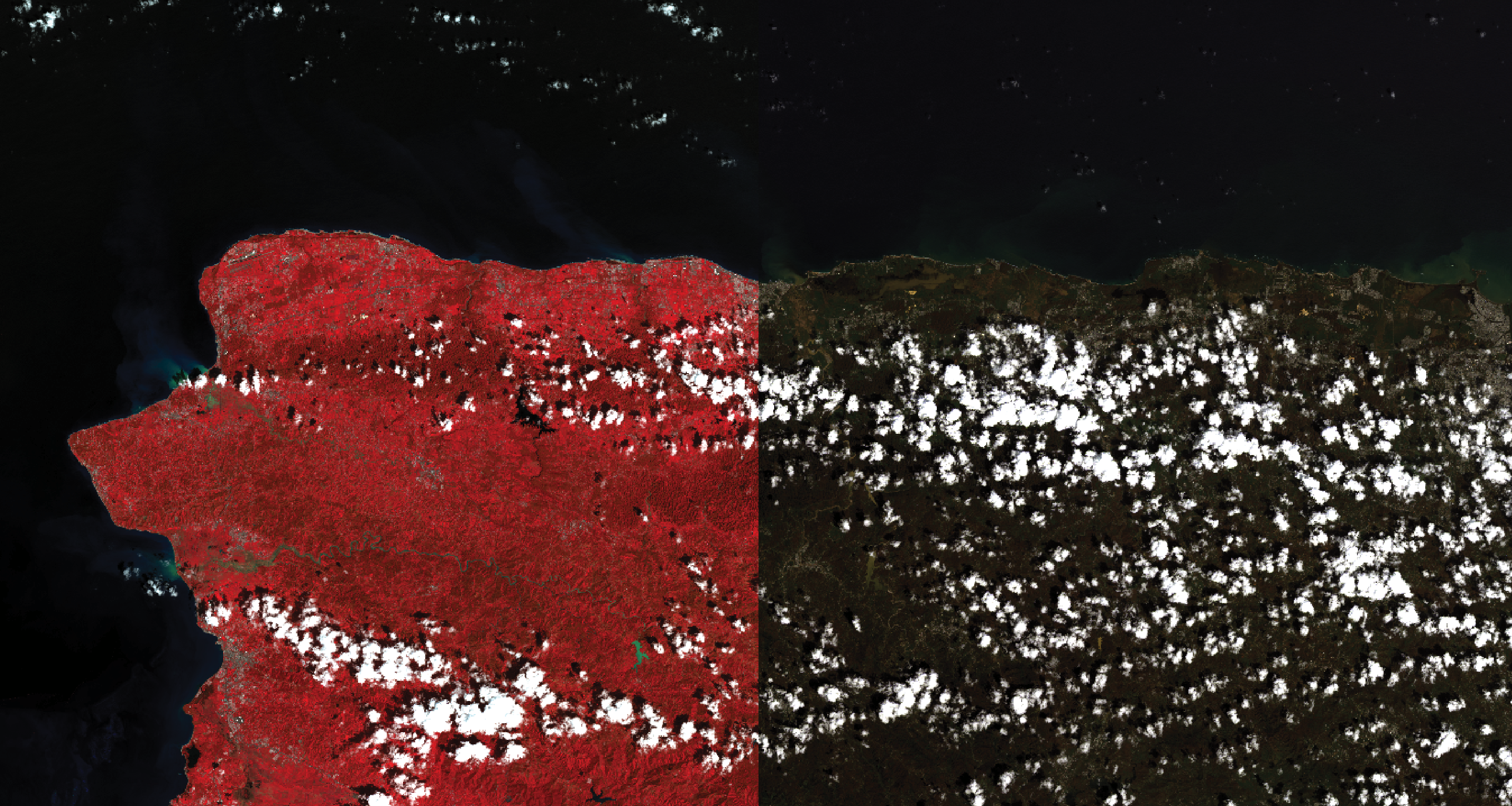
Below shows natural color and ‘near infrared’ false color composite images:
This introduction to remote sensing written by the developer of a remote sensing library for QGIS that we will use in this exercise provides a good entry point to further information on many of these concepts.
Students in this course might be interested in using Landsat satellite imagery as a base map for other analysis, or as an illustration of change over time in a particular area.
The Landsat satellite circles the globe on a 16 day cycle. This page from the USGS is helpful for identifying the days of coverage for a particular area. From it we can see that the western portion of Puerto Rico is falls between two paths of the landsat’s orbit: the western portion of the island is captured on Day 1 of the cycle, and the easter portion is captured on the 10th day of the cycle.
For a history of the Landsat Satellite program please see NASA’s website here
This exercise will walk through how to create false color composites using multiple landsat bands IN QGIS and also how to download Landsat data from USGS.
Creating False Color Composites
We will use a tool called the “Semi-Automatic Classification Plugin” (SCP) to assist us with creating composite images from the bands of the Landsat images we just downloaded. This plugin has been developed by Luca Congedo and is released under the “Creative Commons Attribution-ShareAlike 4.0 International License.” It is an example of the kind of open source tools being developed by the QGIS community.
Full documentation as well as related resources for this set of tools can be found here.
The SCP plugin provides a number of tools related to satellite image processing and analysis.
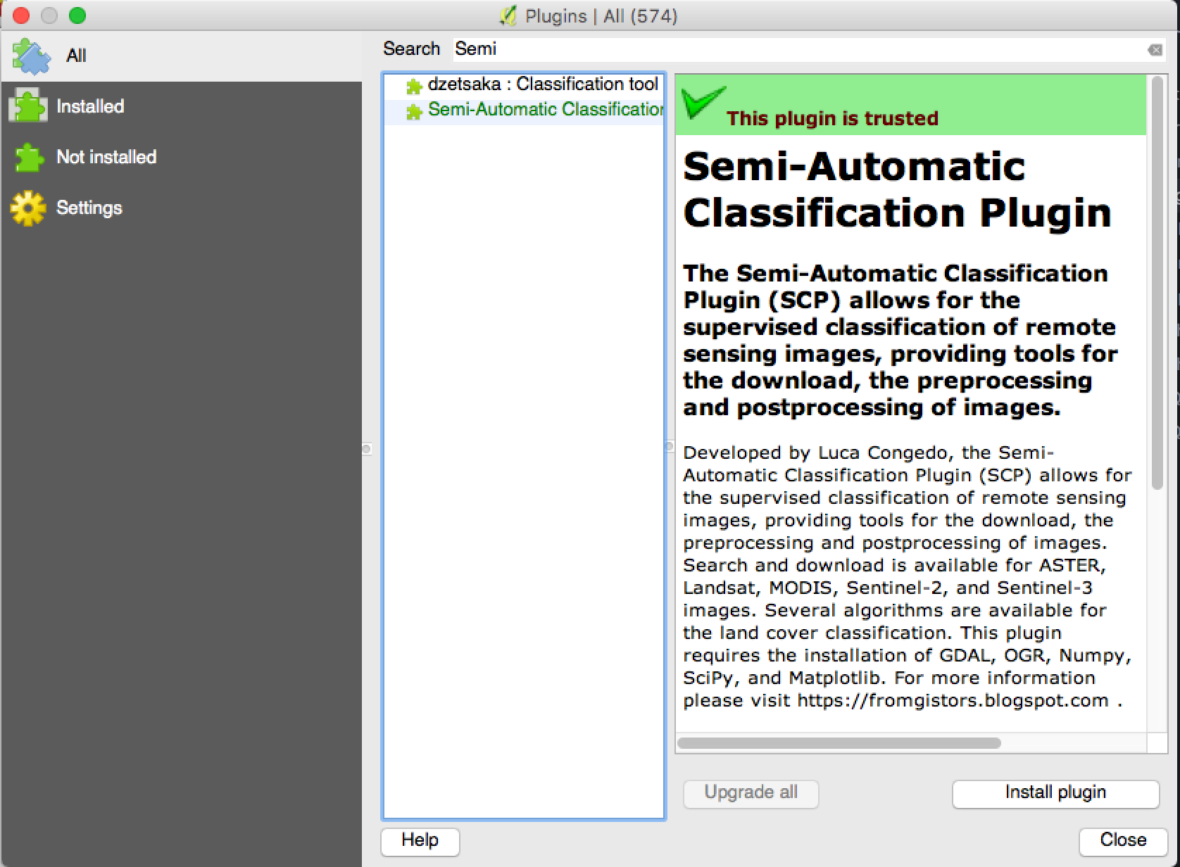
Install the Semi-Automatic Classification Plugin
Navigate to the Plugins>Manage and Install Plugins from your menu bar.
Search for and install the Semi-Automatic Classification Plugin
When the plugin has finished installing make sure the check box next to the plugin’s name is checked and select Close.
A new toolbar and dock should have been added to your QGIS window. The are highlighted below in magenta. If these did not open for you, right click anywhere inside one of the grey toolbars surrounding the map canvas and select SCP Dock in the panels section, and SCP Tools and SCP toolbar in the toolbars section.
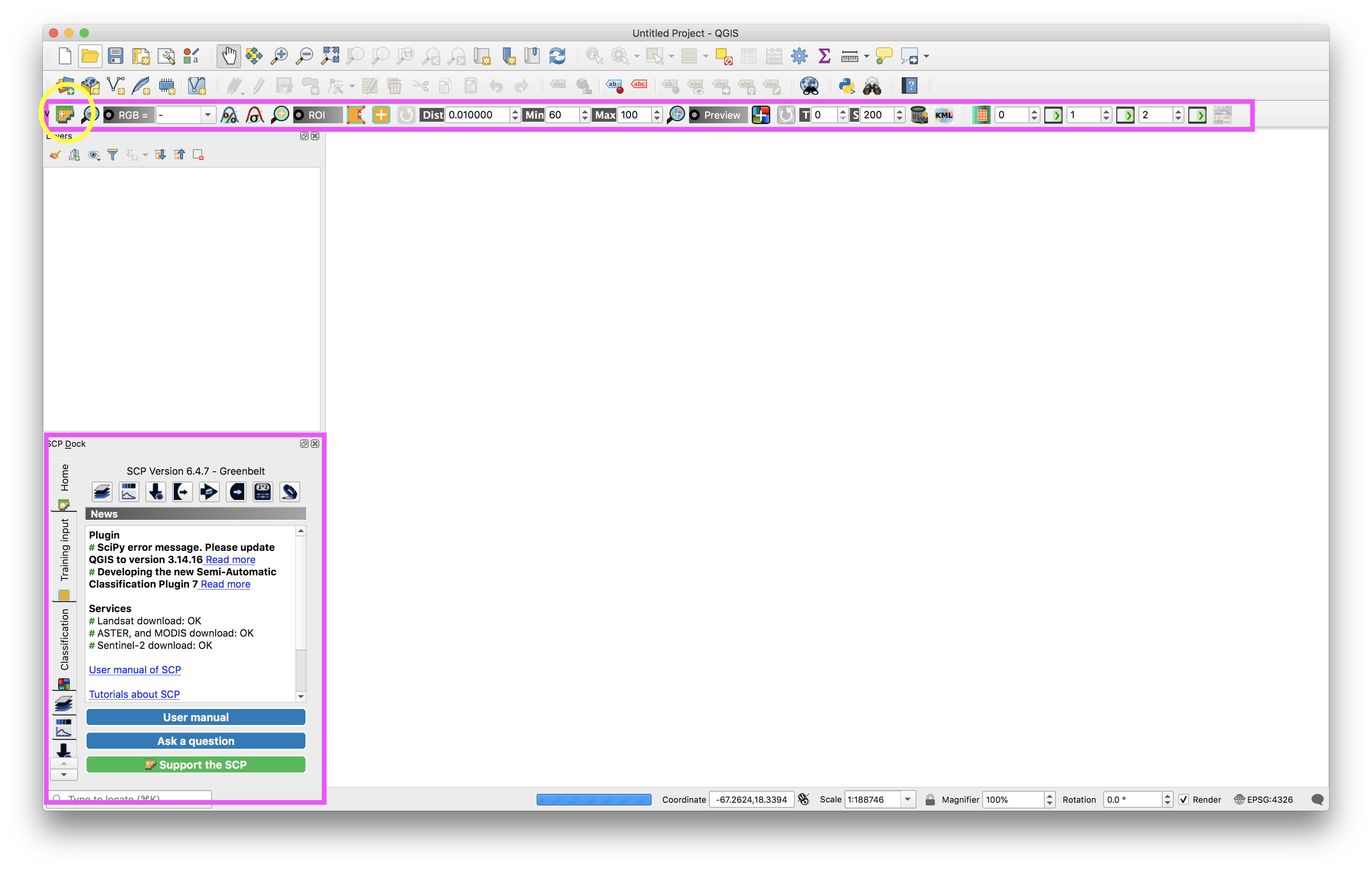
Load Landsat data and create a “Band Set”
Open the Semi Automatic Classification Plugin menu by clicking the icon circled in yellow above.
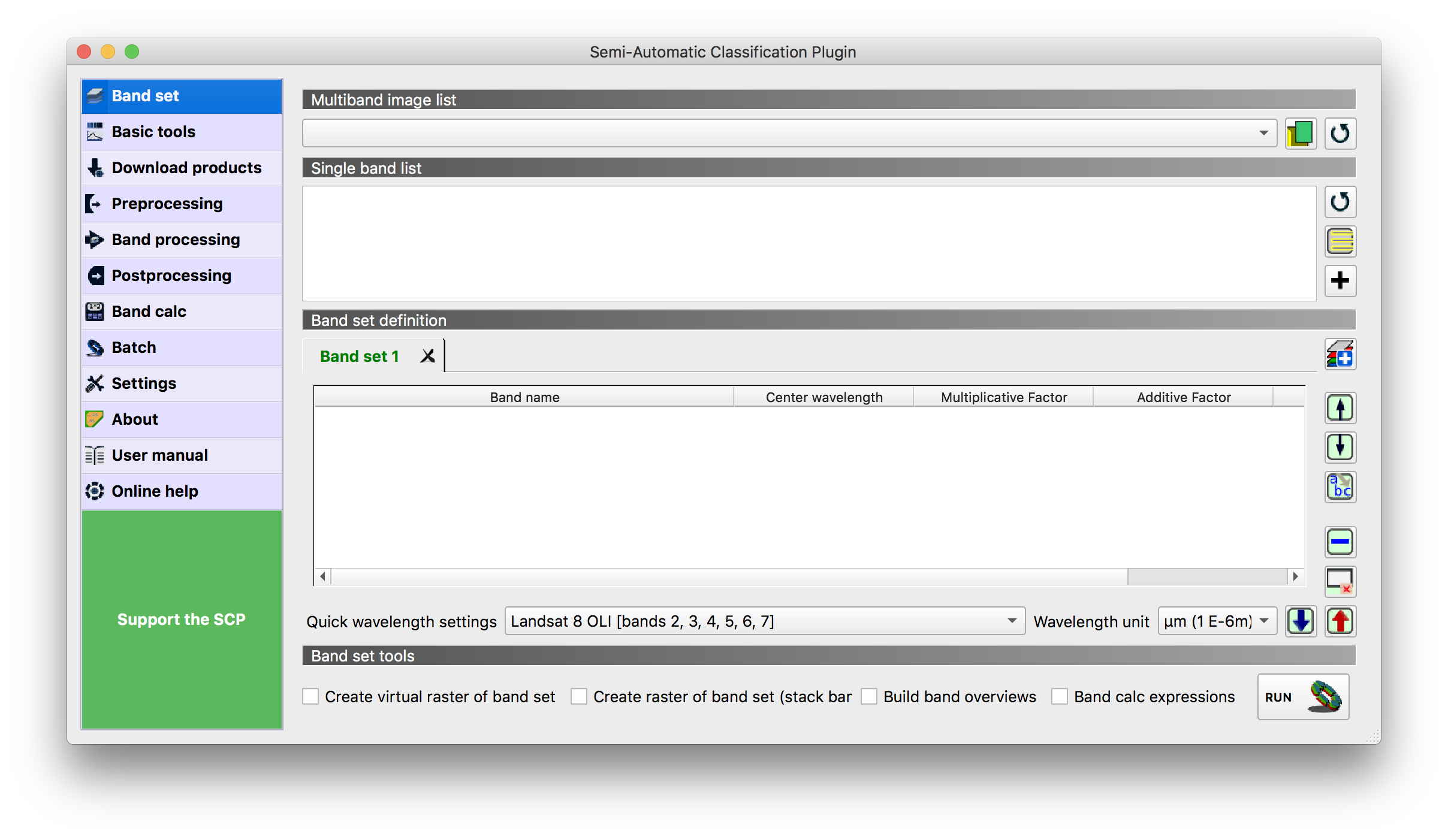
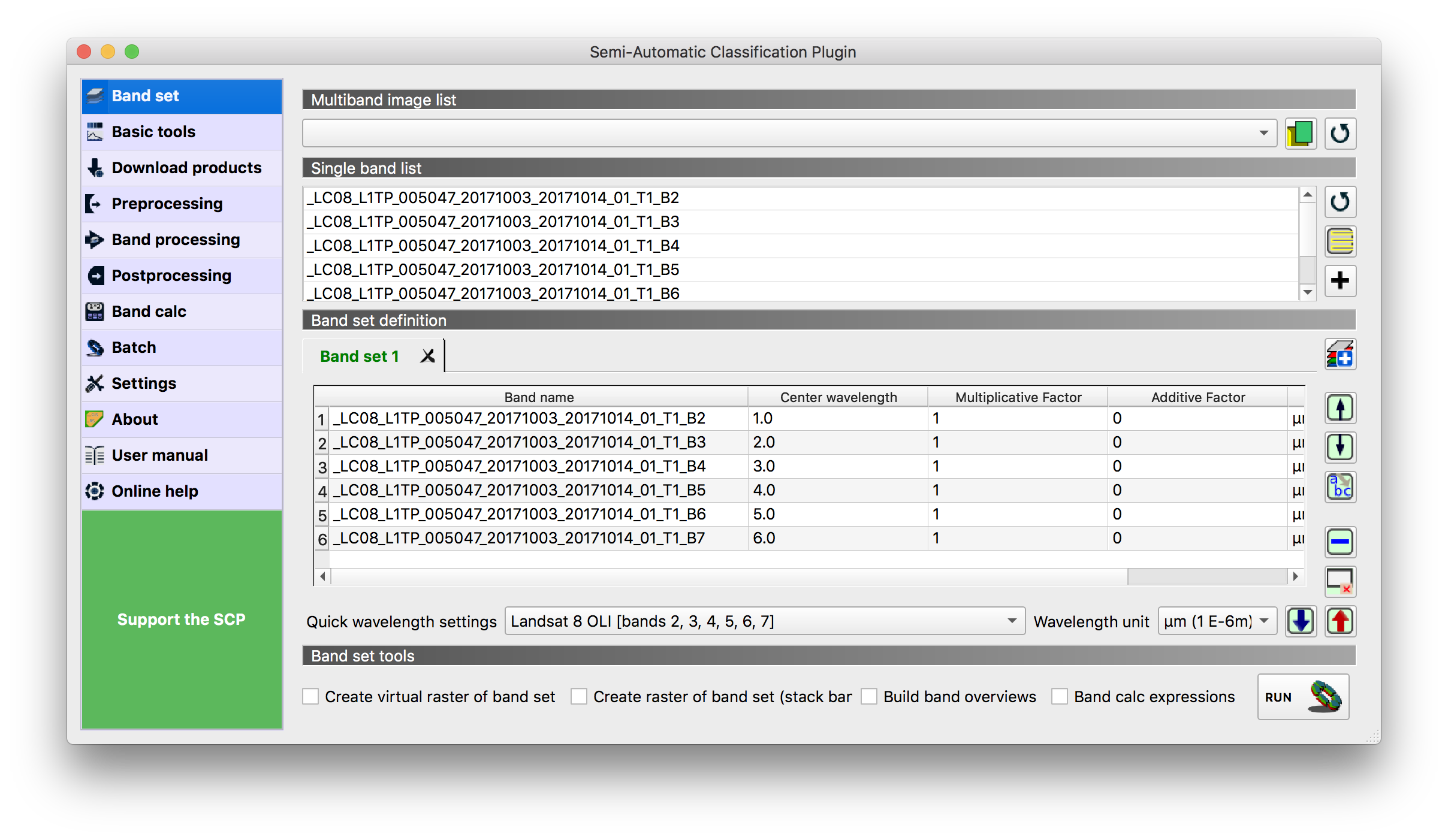
Click on the Open a file button (circled above) and navigate to the directory containing the Landsat bands you want to work with for this example it is part_b_data>raster>landsat. And then first choose the folder containing the October 3 Landsat image bundle LC08_L1TP_005047_20171003_20171014_01_T1).
Select bands 2-7 in the folder (all of the files with a .tif ending) And click Open.
You should just have bands 2, 3, 4, 5, 6, 7 in this list. Make sure you have no other bands.
Select Landsat 8 for the Quick Wavelength settings. This automatically loads in information about the wavelengths of electromagnetic spectrum captured by each landsat band.
Your dialog box options should look like this:
Close the SCP menu.
Then locate the RGB option in the SCP Working toolbar.
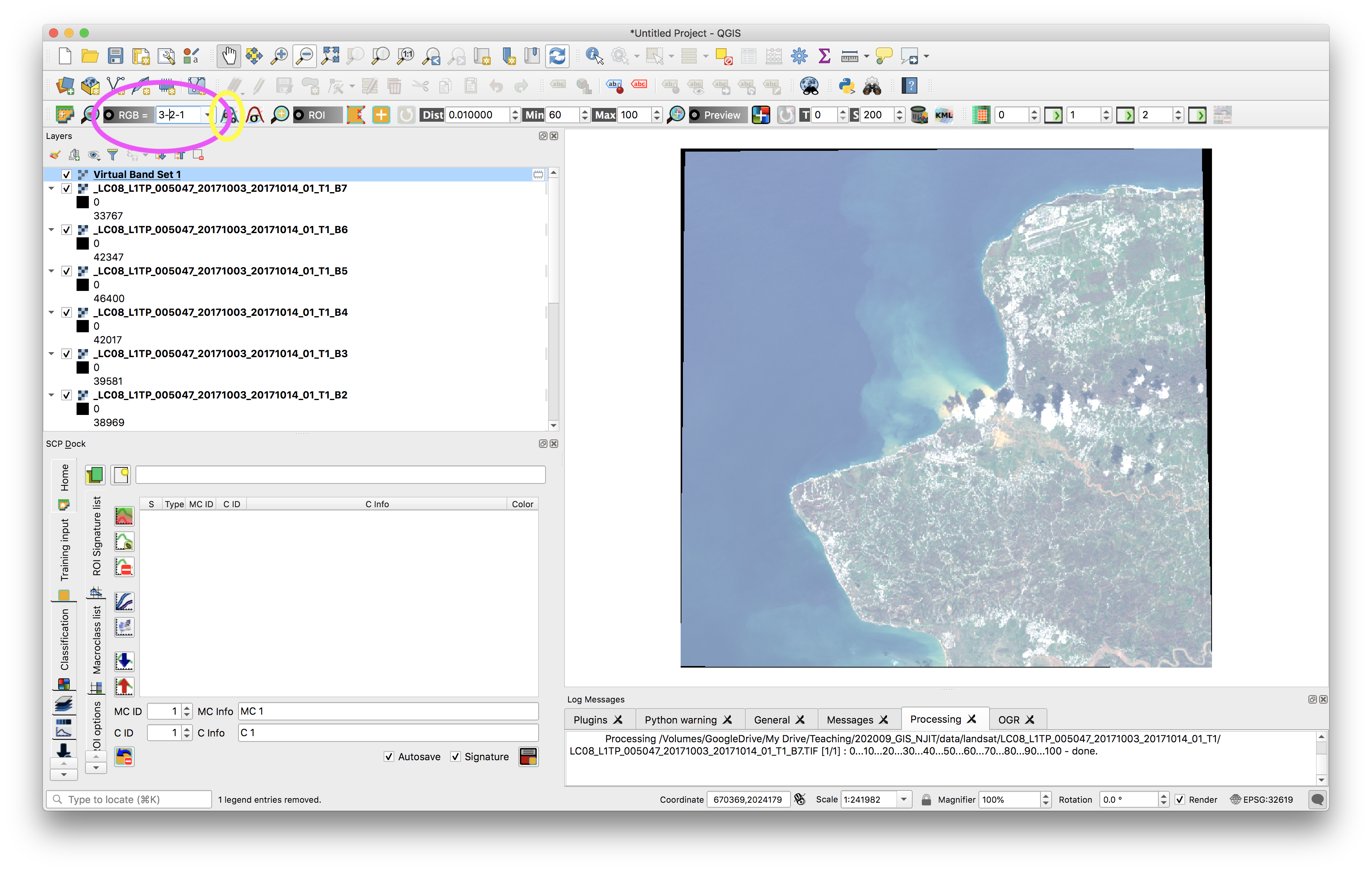
This tool tells the program which band it should map to the red, green, or blue band of a standard RBG image. Setting band 3 and Red, band 2, as Blue, and band 1 as Green will show a natural color image whose colors are similar to what we are familiar with. This combination is similar to what we see with the naked eye because it uses the bands that capture electromagnetic wavelengths in the visible light spectrum.
Note: to make the image appear more saturated zoom in to a bright-ish area of the image and then click the Local cumulative cut stretch button (circled in yellow above)
Further information about band combinations and the kinds of phenomena they make visible can be found here. Take a look through this document and try out combinations that are interesting to you.
A color composite using 3-2-1 for a ‘natural color’ image:
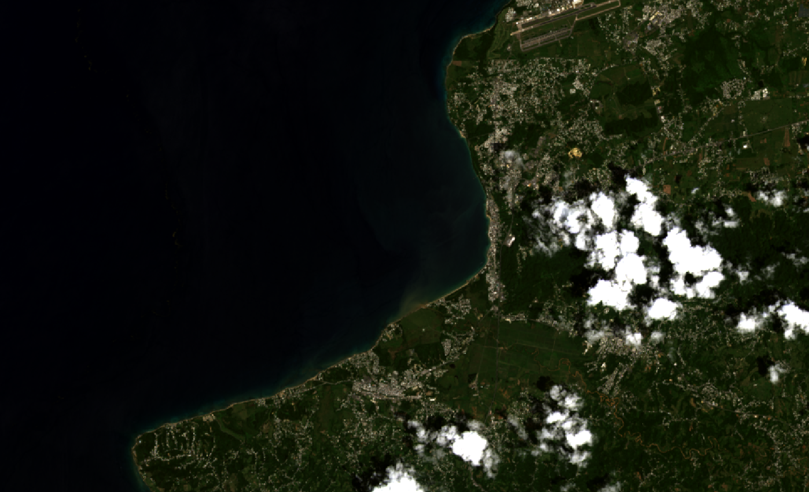
The combination of bands 4-5-3 is particularly well suited for looking at land/water boundaries as well as levels of water saturation.
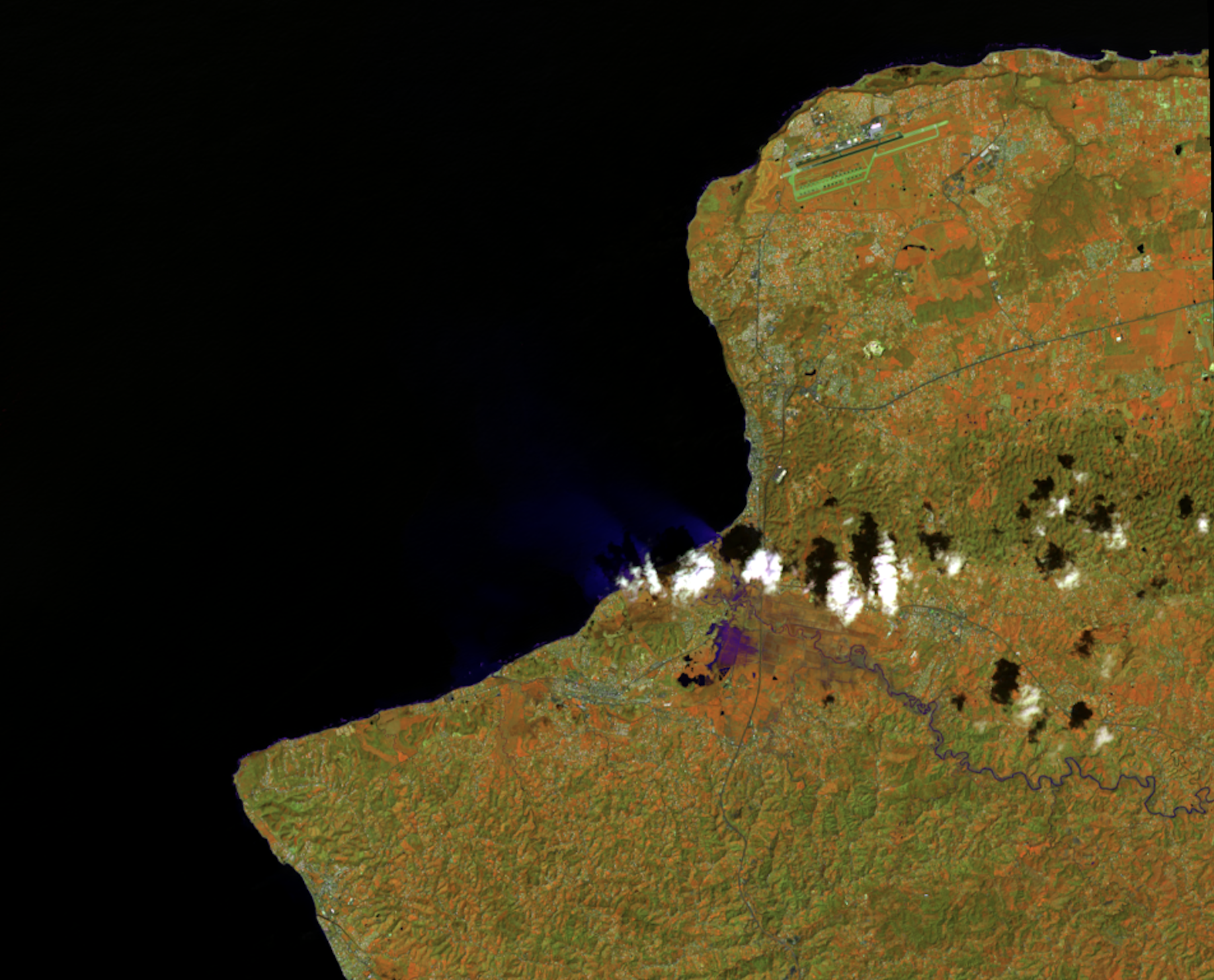
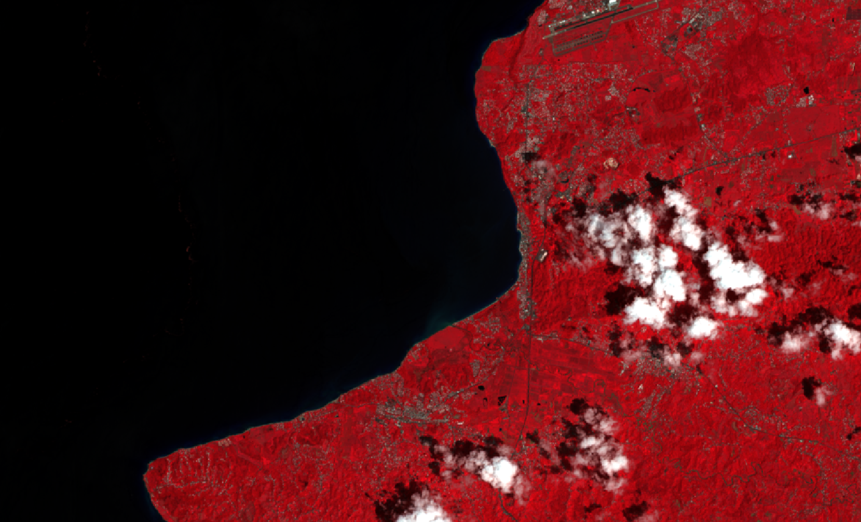
Or to view a ‘near infrared’ image set the RGB band values to 4-3-2. This type of ‘false color composite’ image is similar to infrared aerial photography and highlights vegetation in shades of red. Try these and others.
Export false color composites
To export a false color composite as a GeoTiff image (that freezes the given false color composite you’ve chosen) right click on the virtual band set in the layers menu. Select save as and choose rendered image as your output mode, and select a location and file name to save the image. This false color composite is now saved, you no longer have access to the raw data of each of the Landsat bands that originally comprised it but you can work with it as a base map or for other uses or bring it into a different program.
If you’d like you can repeat the steps above on the second Landsat image bundle we downloaded to compare false color composites before and after Hurricane Maria to see the visible flooding.
Take it further: supervised classification
Beyond false color composites researchers use the spectral signatures for different features of the earths surface to classify land use and land cover and a variety of other phenomena. The USGS for example produces and maintains data on land use and land cover which it creates using Landsat and other remotely sensed data.
You can create your specific land use classifications using something called supervised classification. This is beyond the required scope of this assignment but if you are interested in going further please follow the instructions for using the SCP for creating your own land use classification contained in this external tutorial here
For feedback and credit on Assignment 02b part 02 turn in:
Download a different landsat scene (following the instructions below) for some other area – perhaps where you are from, a location you are working on for studio, the main point is that it should be somewhere you are interested in and know something about. Read about false color combinations here and choose a false color composite to highlight some aspect of that location. The false color composite should be chosen so that it supports a visual narrative about that place – for example you might choose a composite that makes urban areas very bright or that shows agricultural areas very clearly.
Downloading Landsat satellite images
Landsat satellite data is freely available and can be downloaded via a number of different websites. We will be using the USGS website: EarthExplorer
These are instructions for how to download Landsat satellite imagery via USGS for future reference. For this assignment landsat scenes were already provided to you, so scroll down to the next section.
- Select
Registerand then follow steps to Register for an EarthExplorer account - Use the map to zoom in to your area of interest
- In the
Coordinatesbox select theUse Mapbutton. Coordinates around the area you are viewing will populate into this menu.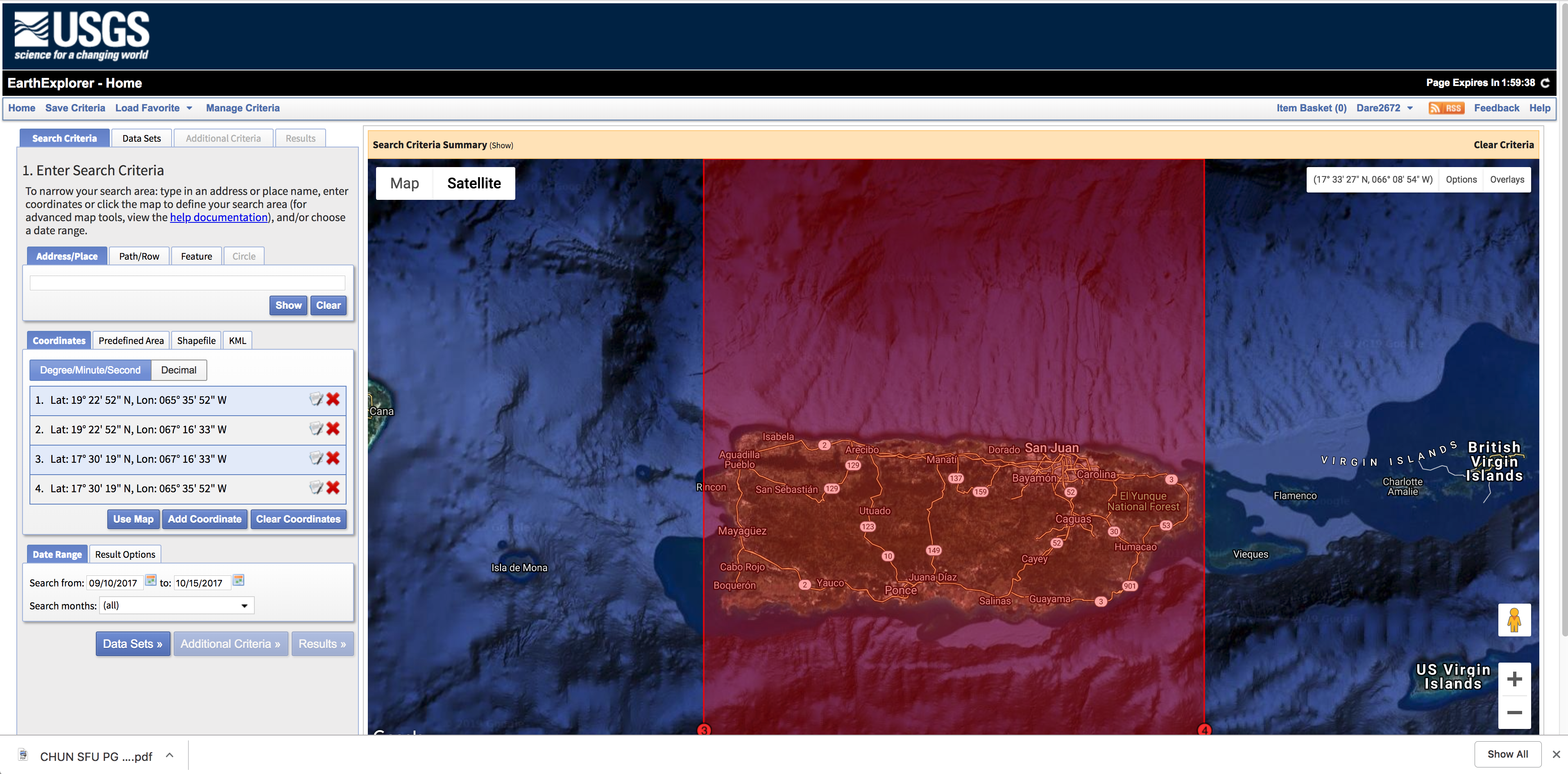
- Select the date range you are interested
- Click through to
Data Sets - In the
Data Setsmenu open the nested section forLandsatand then forLandsat Collection 1 Level-1 - Check the box next to
Landsat 8 OLI/TIRS c1 Level-1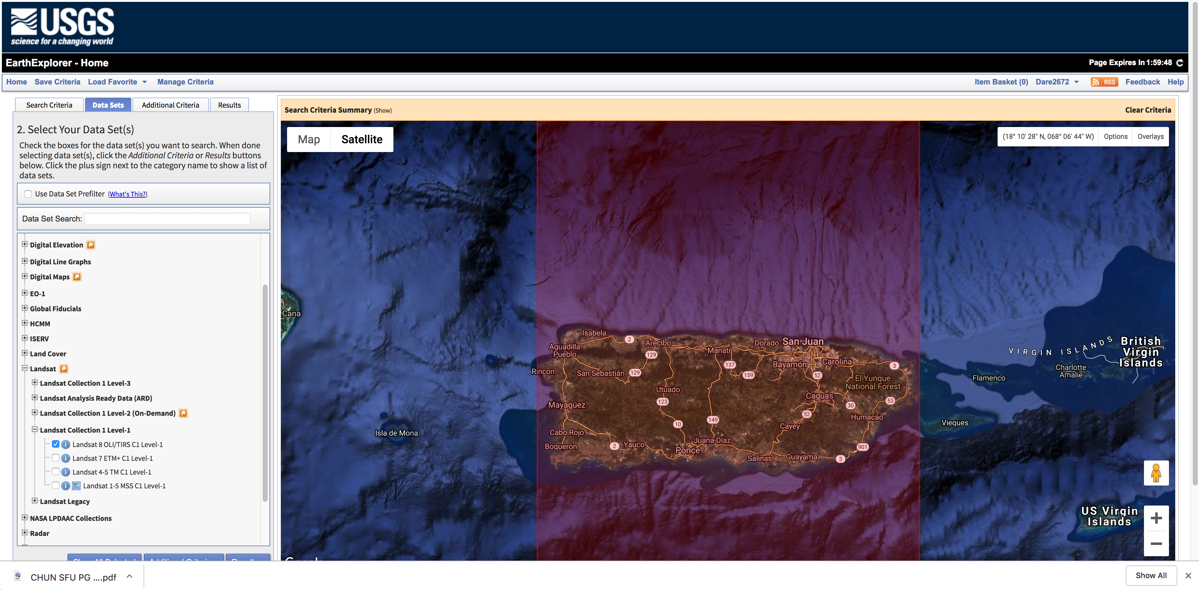
- Select
Additional Criteriawe will not make any selections here in this exercise, but note for future reference that you can use this to search only for images with less than a certain percentage of cloud cover. -
Select
Results. You should see a number of images for specified dates and paths. Here you can view the footprint of each image. As well as select images for download. -
Find the images you are interested in downloading.
- Click on the download icon (looks like a hard drive and a green arrow) for the first image.
- In the Download Options menu that will open, select
Level -1 GeoTIFF Data Product. This is the data set that will include all of the Landsat 8 multispectral bands discussed previously.
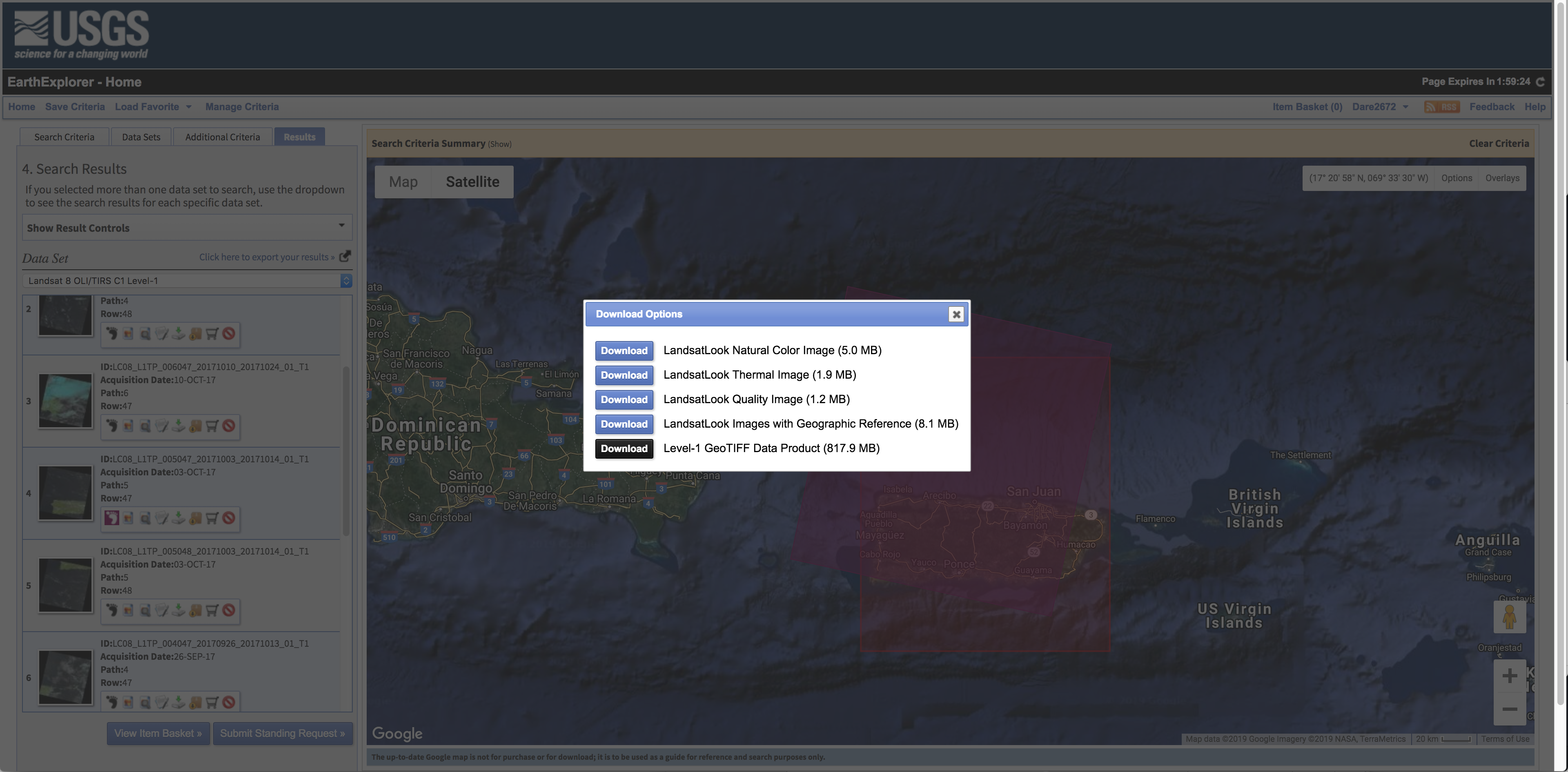
- a zip files will download, unzip it, and save in the working directory you are using for your project.