Assignment 02a: Mapping Values and Categories (with vector data)
Due: October 14, 2020
note: Assignment 02b is also due on October 14 and will be distributed on 10/7
Premise of Assignment 02a:
In this exercise you will create a series of maps of housing tenure in Newark in order to identify which areas of Newark have the most rental housing. In the data folder for this assignment, tabular data on housing tenure by census block from the 2010 Decennial Census (Summary File 1) is available along with census block boundaries for the city of Newark. You will use these two datasets to map where in Newark there is the most rental housing.
Assignment 02a Deliverables:
To receive credit and feedback on this project please upload the following to canvas by 10/14.
Three designed map compositions, which include key map elements (legend, scale bar, north arrow):
- Absolute number of rental housing units, symbolized with natural breaks (Jenks)
- Dot density of rental housing units (choose a value of dots per housing unit that produces a legible map)
- Rental housing units normalized by total housing units, symbolized with natural breaks (Jenks)
Short answer question:
- Based on these three maps discuss which areas in Newark have the most rental housing units. On which map are you basing this conclusion? Does each map tell the same story? If not why not? Interpret the differences between each map based on our discussions of classification and symbology.
Please submit:
- one .pdf file with all three maps, one per page.
- one .txt file including your response to the above question
Adding Data
Open QGIS3.10 and create a new project
From the top menu bar select Layer and then Add Layer > Add Vector Layer.
When the Data Source Manager menu appears select the Source Type as File then click on the ... and navigate to the data folder for this assignment. In the Vector>census_blocks folder is a geojson file tl_2010_blocks_newark.geojson containing census blocks for the city of Newark. Add this to your map.
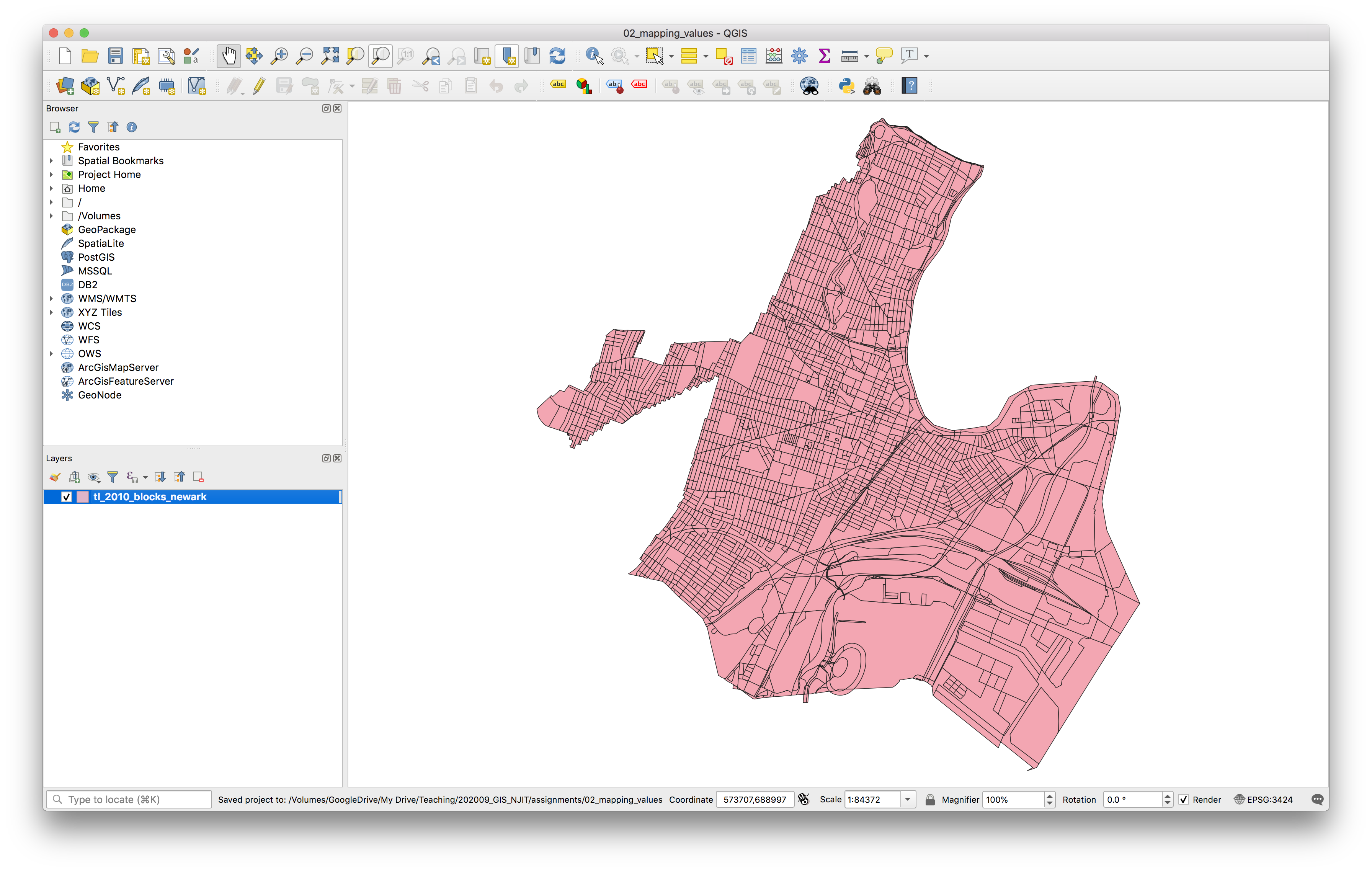
Save your QGIS project in the 02_mapping_values folder. Save it as .qgz file with a reasonable file name.
Open the attribute table for this file to inspect the fields. You’ll notice there is a lot of identifying information (a GEOID, codes for the state and county of each census block) but there is no other information about demographics or any other information about things going on inside these census blocks.
Data is released from the U.S. Census as tabular files (.csv format generally) and in order to visualize the housing tenure for Newark you must first join this tabular information to the census blocks for the city of Newark. This is something called a table join where we are able to attach additional attribute information to a vector dataset if there is a common identifier field with unique values in the vector dataset and the tabular data with further attribute information.
First we need to add the census table containing information about housing tenure to the QGIS project.
Navigate to Layer and then Add Layer > Add Delimited Text Layer. When the Data Source Manager menu appears navigate to the data folder for this assignment and select Tabular > 2010_decennial_census >DECENNIALSF12010.H4_data_with_overlays_2020-09-22T194740.csv. Then make the selections seen in the screenshot below:
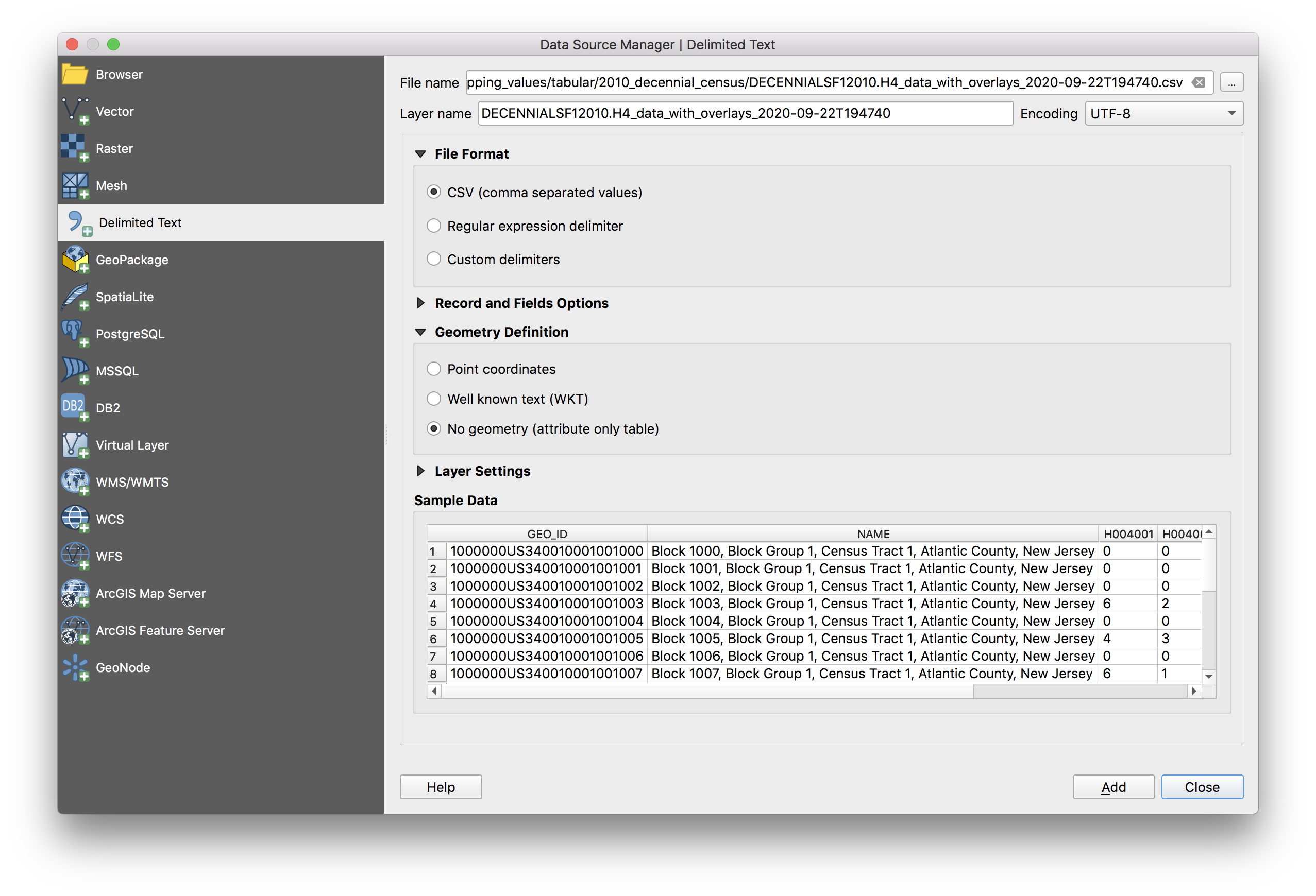
An aside about file names + table numbers: when you download information from the census the file names are encoded with identifying information about which table and survey the dataset came from. In addition this information is listed in the DECENNIALSF12010.H4_table_title_2020-09-22T194740.txt file which contains the source. In our case we are using Table H4, from Summary File 1, from the 2010 US Decennial Census.
Open the attribute table for the census table about housing tenure. Each row contains information about one census block. The GIS_JOIN_GEOID field was created for you to assist in the table join below and matches exactly with the GEOID10 field in the Newark census blocks vector dataset.
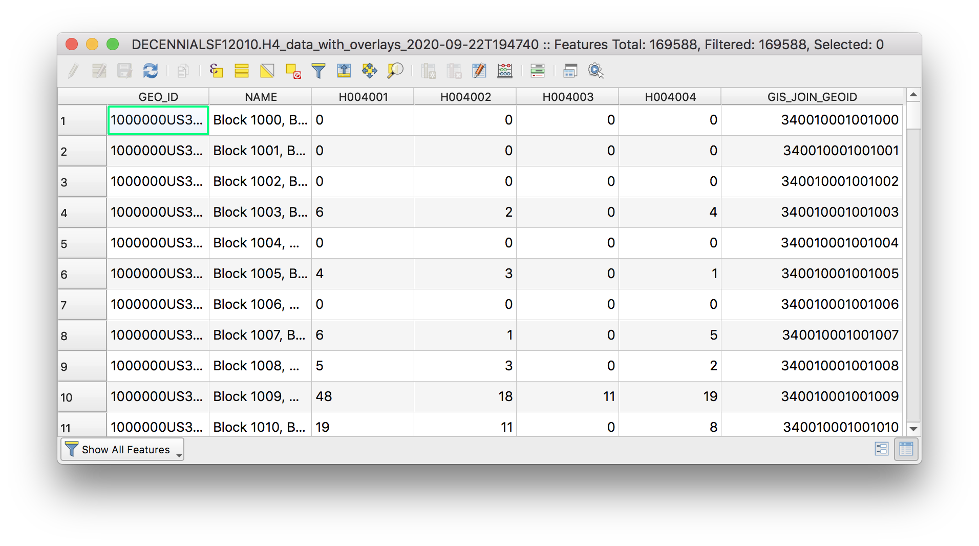
Notice that the field names are coded. In order to interpret / understand these fields we must look at the metadata released with this dataset. In your computer’s file browser navigate to the data folder for this assignment and then to Tabular > 2010_decennial_census open the metadata file: DECENNIALSF12010.H4_metadata_2020-09-22T194740.csv, you can do this with excel or with a text editor
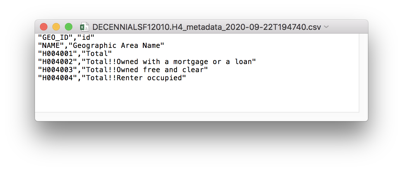
This metadata (which literally means ‘a set of data that describes and gives information about other data’) translates/decodes the field names in the census table.
Which field contains information about rental housing units?
Performing a table join
Now that we have added the census table to the map you will perform a table join to associate the information in the Housing Tenure census table with the census block boundaries for Newark. By performing a table join we will be able to make a map from data that was previously only available as a table. This is a form of creating spatial data. It is important to note that a table join is a temporary relationship, you are associating information from a table with a vector dataset however you have not done anything to change either of the underlying datasets.
In a table join you are able to append additional attribute information from a table to a vector dataset if two conditions are met:
- there is a common identifier field in the vector dataset and the tabular dataset with further attribute information
- that common identifier field has unique values (i.e. no two census blocks have the same ID)
Remember from above that each row in the Housing Tenure table contains information about one census block and that the GIS_JOIN_GEOID field was created for you to assist in the table join below and matches exactly with the GEOID10 field in the Newark census blocks vector dataset.
This means that we can easily perform a table join to append information from the Housing Tenure table to the attribute table for the Newark census block boundaries.
In a table join there is a target layer and a join layer. The target layer is the layer you are joining information to (in this case the Newark census block boundary file). The join layer is the layer you are appending information from (in this case the census Housing Tenure table).
You always initiate a table join from the target layer.
Right click on the Newark census block boundaries to open the Layer Properties menu. Select the Joins tab. Click on the green plus sign to begin a new table join.
In the add vector join menu that opens make the following selections for the Join layer, Join field, and Target field. Be sure to edit the Custom Field Name Prefix. Click OK
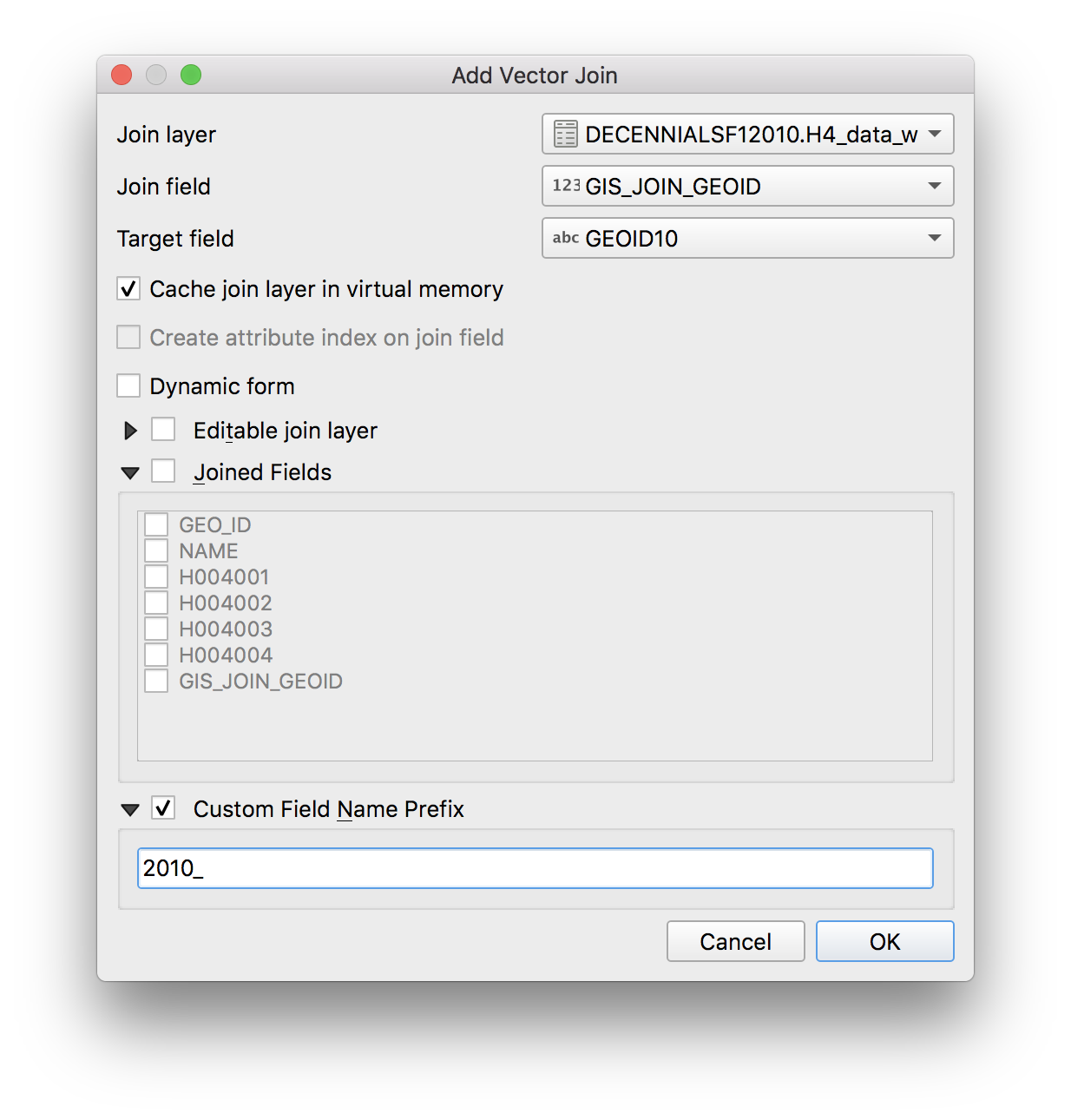
Then in the vector join menu click Apply and then OK.
Whenever you do an analysis step in GIS, look away from your computer for a moment and think to yourself in advance: what am I expecting to have happen? Then check to see if the change you made matches your expectation. If it doesn’t try to understand why it doesn’t and what might have gone wrong.
In this case we expect that the columns from the Housing Tenure table will be added to the attribute table for the census block boundary layer.
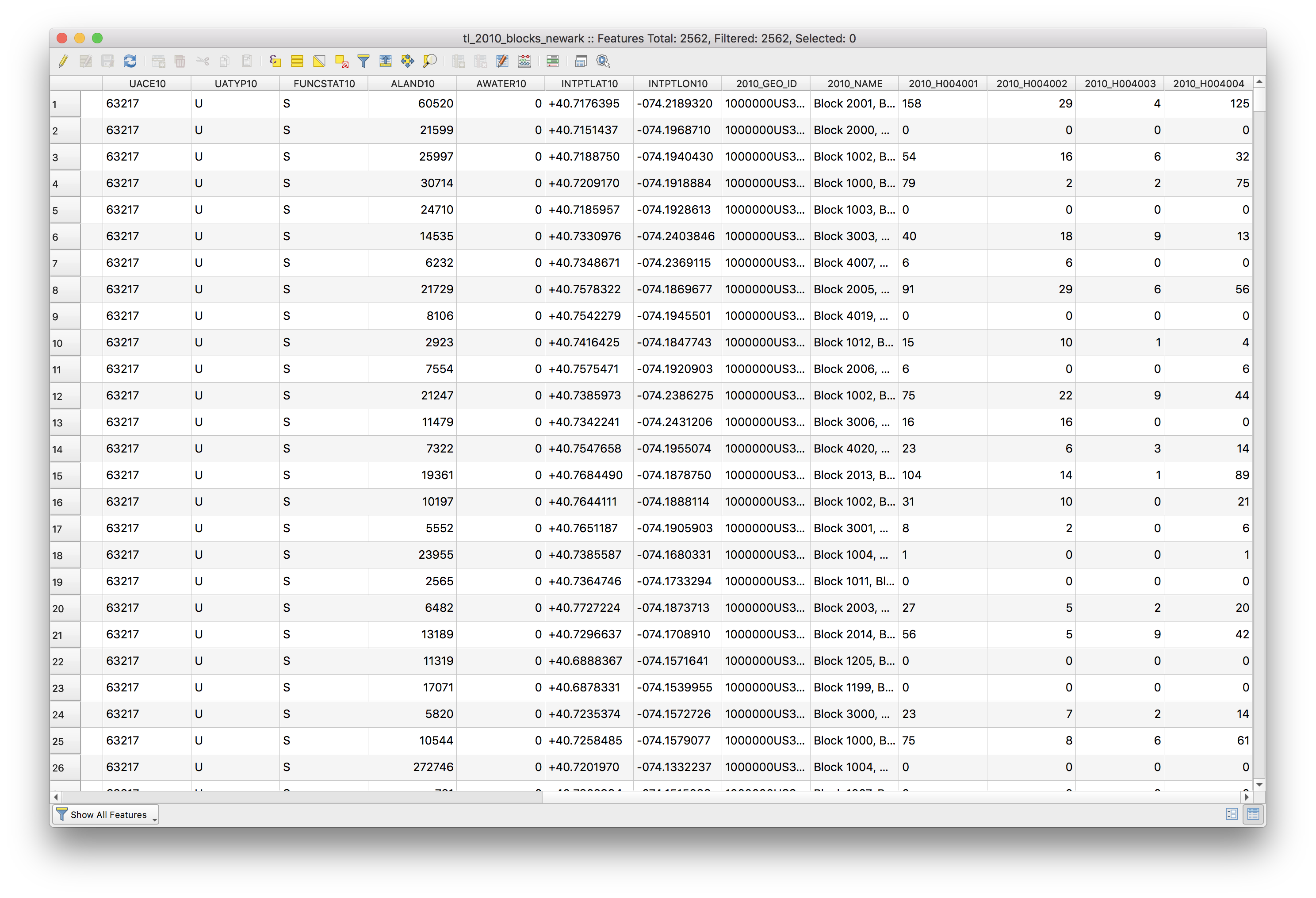
Now, open the attribute table for the Newark census block boundaries to see the results of the table join – to be sure that they reflect our expectation and nothing went wrong.
As noted above a table join is a temporary relationship, we have not modified the target layer’s underlying dataset, but are merely looking at an association between two datasets in our QGIS project. To permanently save the table join, we must save a copy of the target layer after we perform the table join.
Right click on the Newark block boundary file and select Export>Save features as to save a new copy of the census blocks that will include the Housing Tenure information we added to the attribute table.
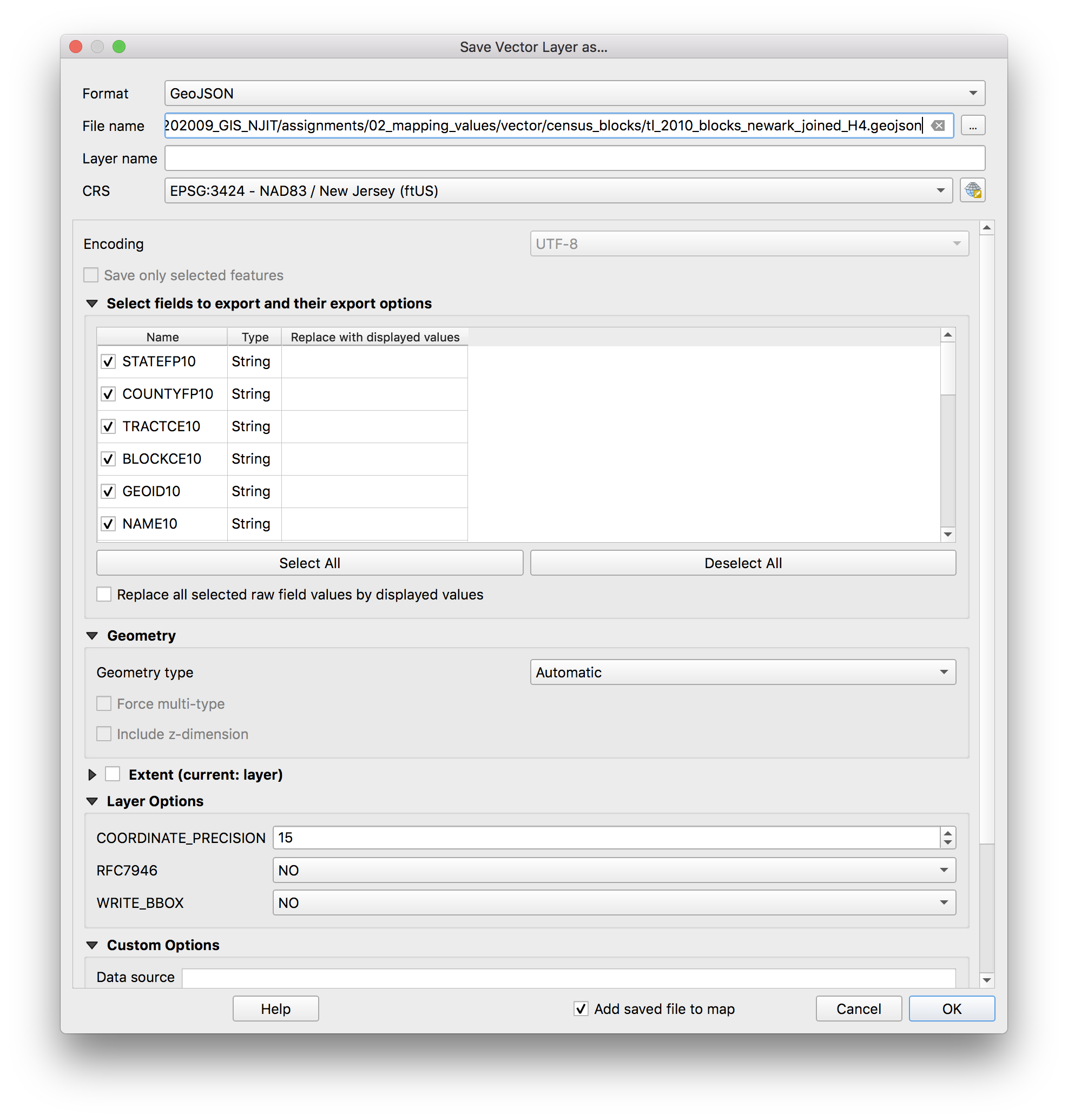
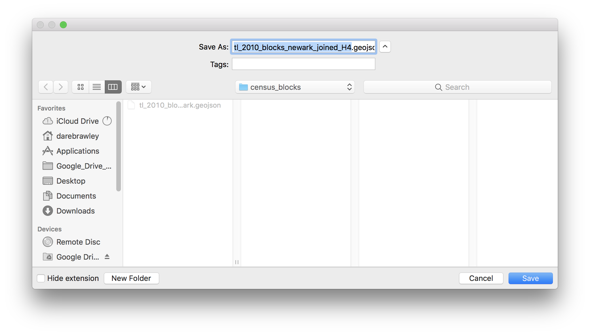
Select geojson as the format. Click the button with three dots to the right of the File name field. Navigate to the data folder for this assignment and the census_blocks folder and save the new file there, setting the file name as tl_2010_blocks_newark_joinedH4.geojson
Remove the other Newark census block boundary layer, and the Housing Tenure table from the QGIS project, so you just have the tl_2010_blocks_newark_joinedH4.geojson layer.
Now you are ready to symbolize the data in your map.
Creating a graduated color map
In this next section you will create a graduated color map (a choropleth map) of rental housing units.
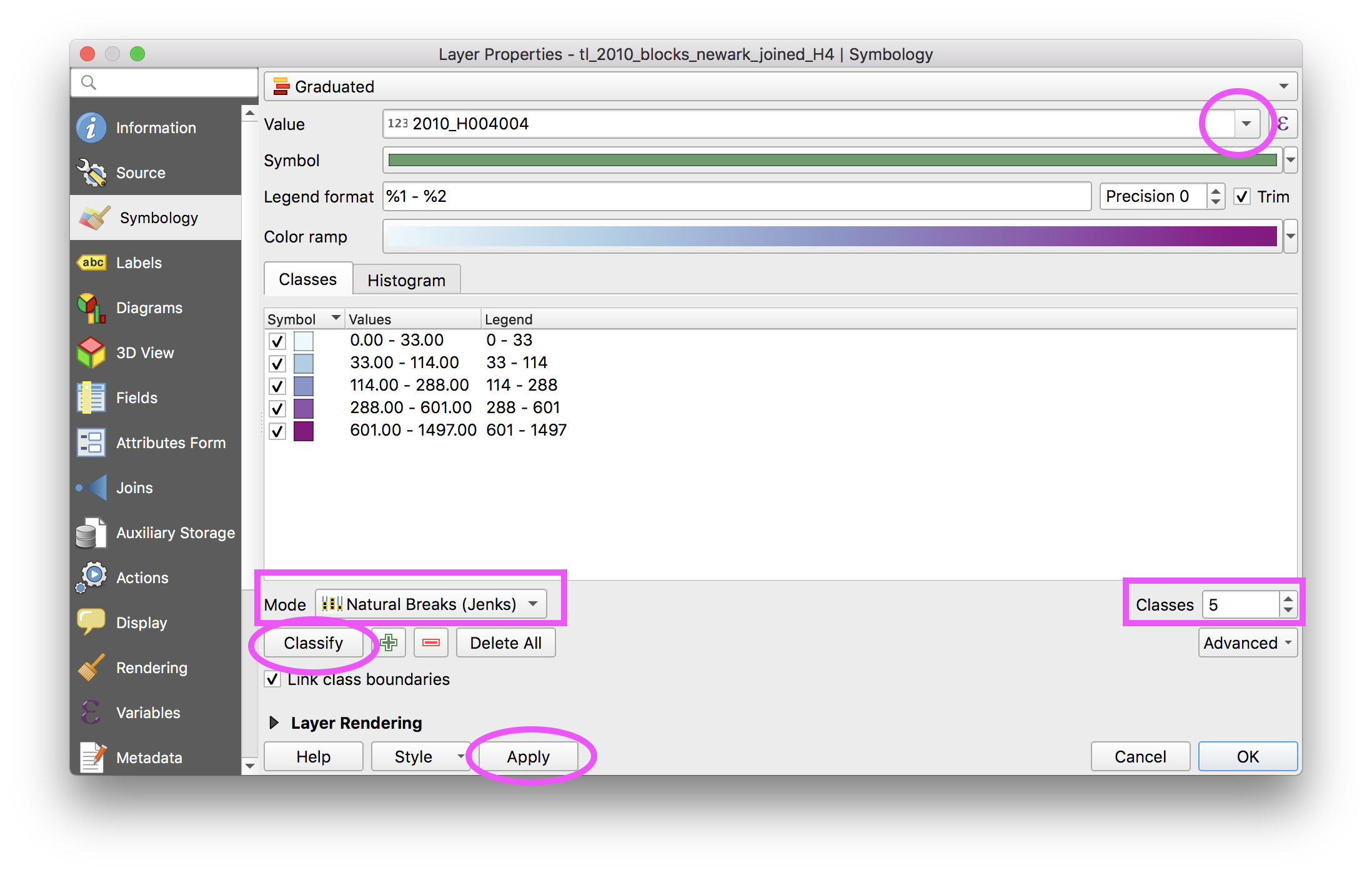
Open the symbology tab in the layer properties menu for the Newark block boundaries which now have housing tenure information in the attribute table from the table join above.
Select Graduated colors. Then from the dropdown for the Value option select the field containing rental units (remember this from the metadata above or check back for it)2010_H004004.
Classify your data. Select 5 classes, and set the Mode to Natural breaks (Jenks). Then click Classify to see the breaks in your data that are created. Click Apply to view these changes on your map.
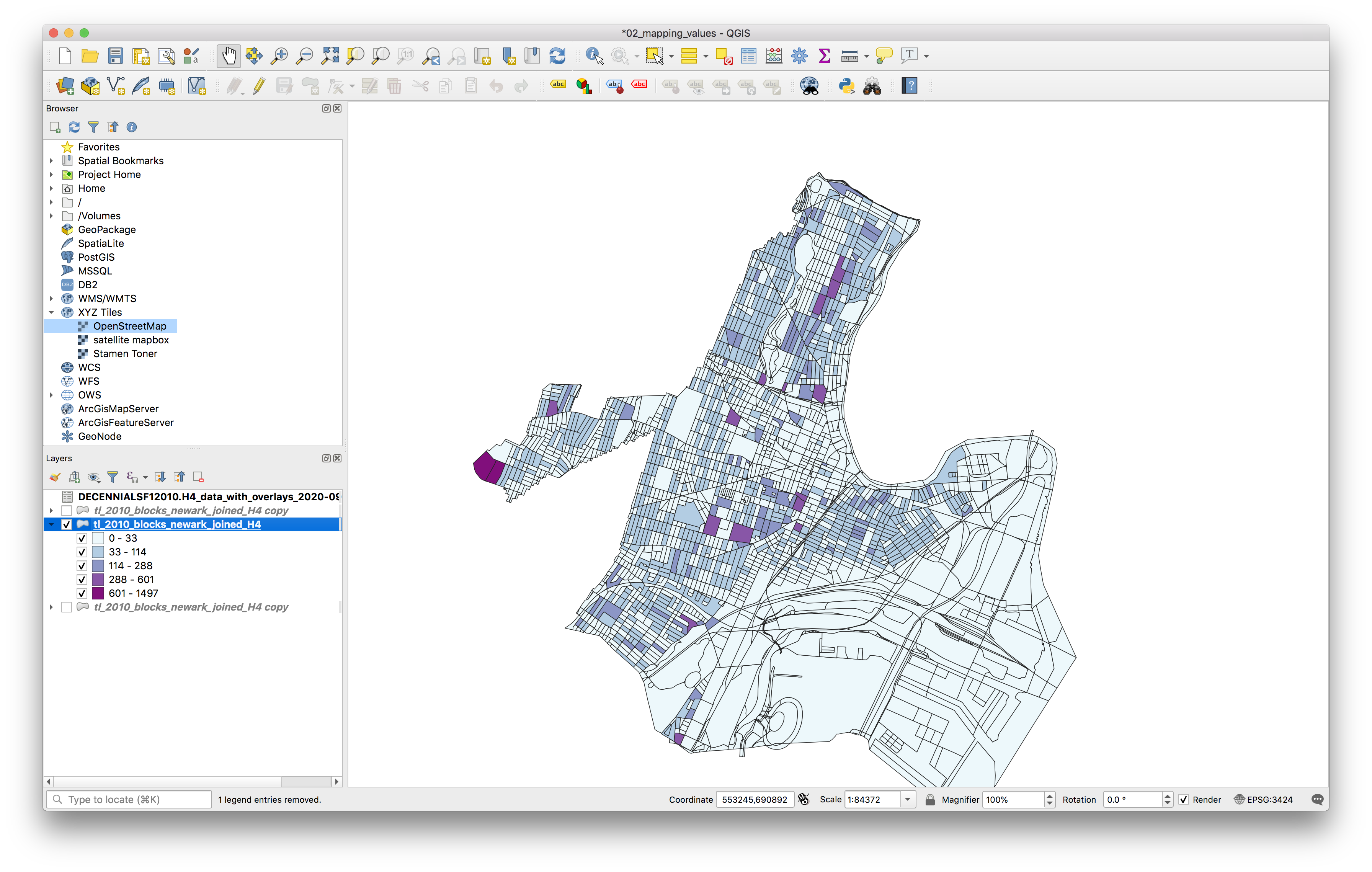
The map should look something like this:
Next click the Histogram tab to inspect a histogram of your data with the data breaks visualized on top. If nothing is visible in the histogram, click load values.
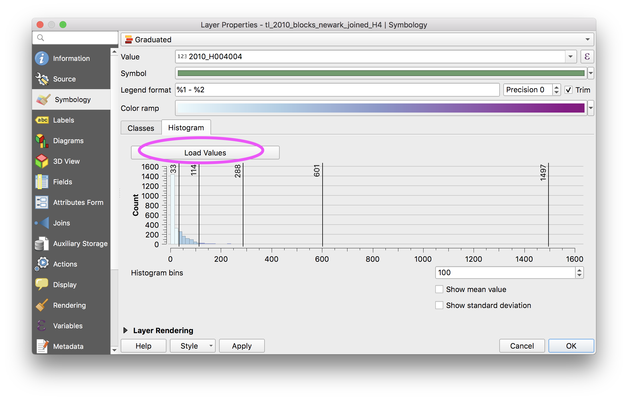
Next return to the Classes tab and change the classification mode to visually inspect the differences between Natural breaks, equal interval and quantile classification modes. Notice how each tells a very different story. Review the histograms for each.
Return the classification to Natural breaks (Jenks) with 5 classes.
Next we will modify this classification so that the breaks in the data are numbers which are easier to interpret.
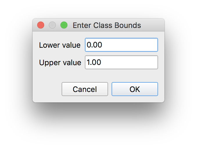
First add an additional class to contain all of the blocks where there are 0 rental housing units. Click the green + icon to add this additional class. When the new class is added, double click on the Value for it and in the Enter Class Bounds menu that opens select lower bound of 0 and upper of 1:
Next, double click on the colored square next to this new class to manually change the color of this class to grey fill.
Then manually set each of the other classes to be round numbers. To adjust double click on the values and enter the upper and lower bounds. You may choose bounds that make sense to you or select the ones below:
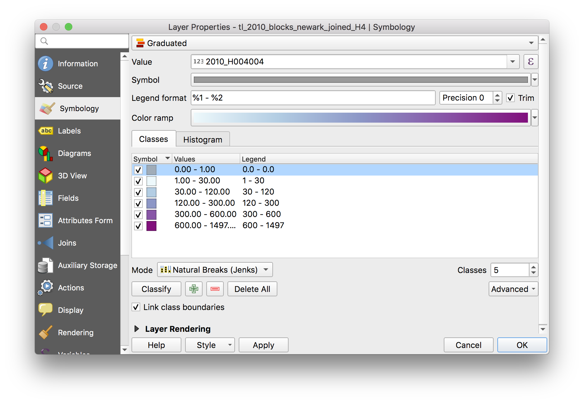
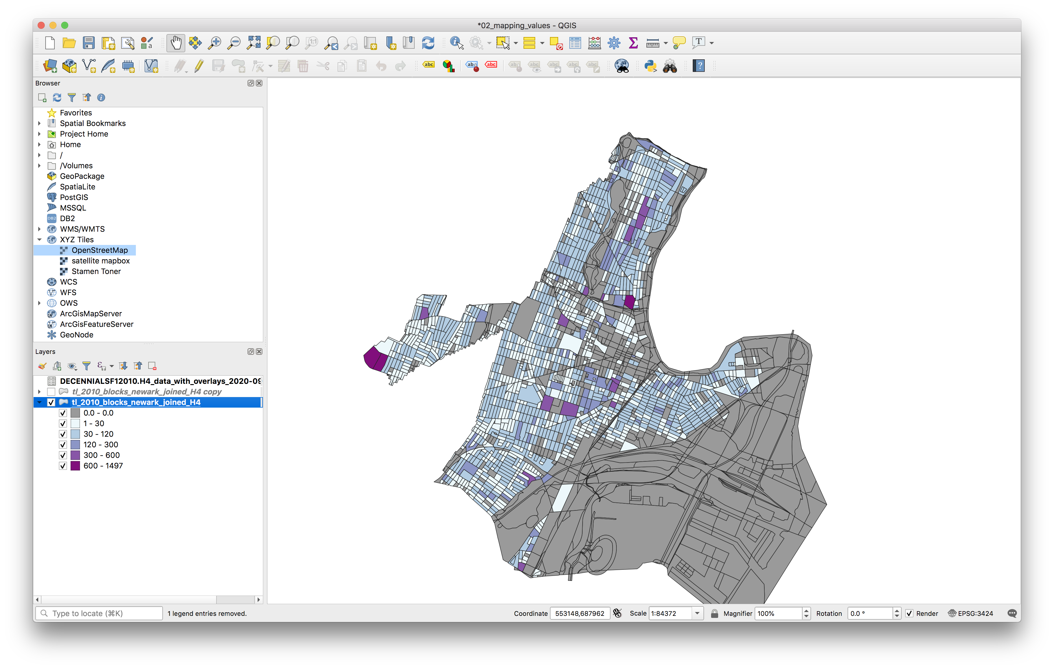
Your map will now look like this:
Creating a normalized graduated color map
Next you will create a second map, showing rental housing units normalized by the total number of occupied housing units to express which areas of the city of Newark are predominantly rental versus not.
Duplicate the newark blocks layer by right clicking on the layer name in the Layers panel and selecting Duplicate layer. Note this does not copy the dataset but rather creates a duplicate layer within your map project. Each layer in your QGIS project is linked to the underlying dataset which is stored on your computer. Duplicating a layer is equivalent to having two copies of the same image within an Adobe InDesign document.
Toggle the visibility of the original Newark blocks boundaries layer off so that you just have the duplicate visible.
Open the symbology menu for this duplicate layer. Select the purple summation symbol at the far right of the Value field.
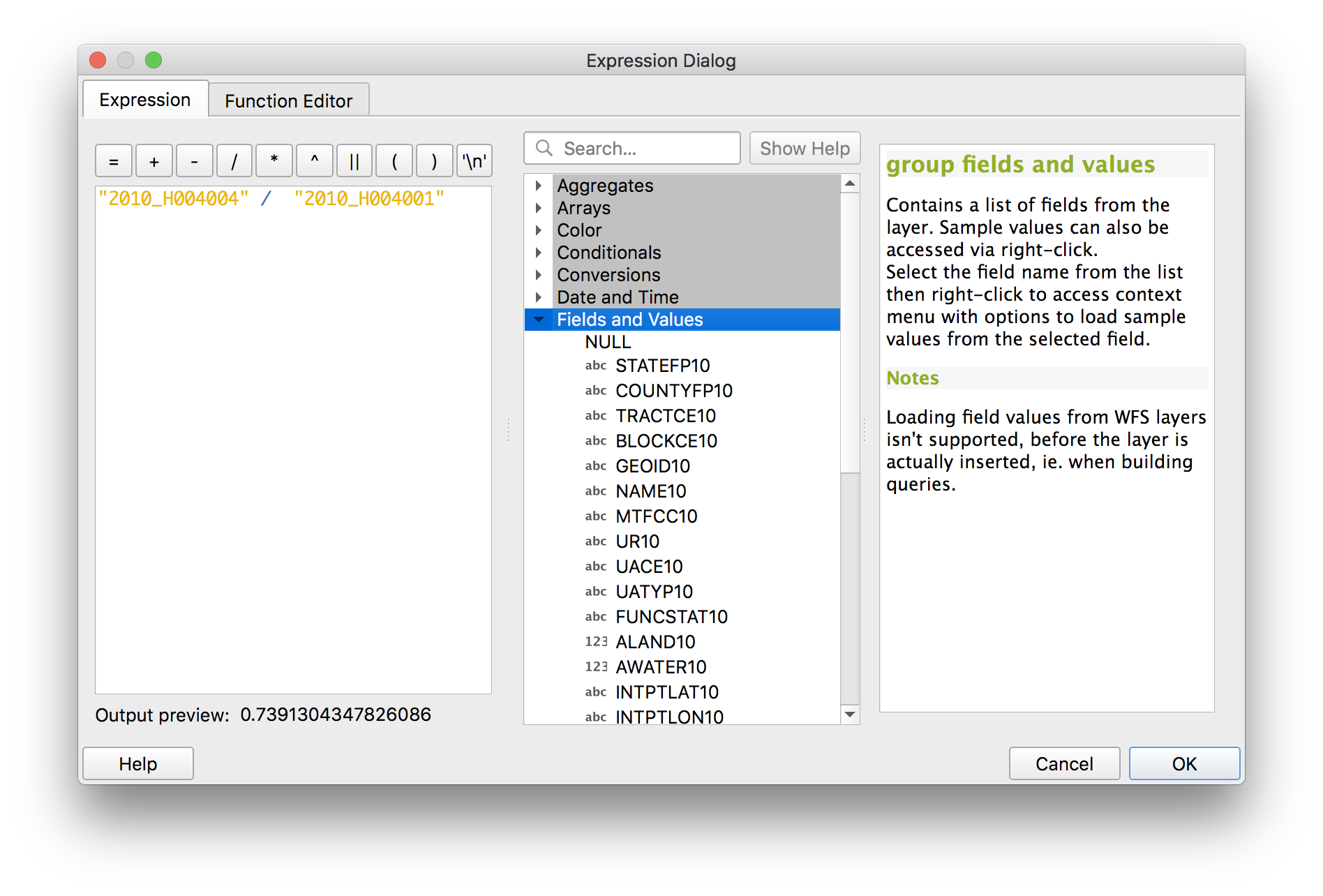
In the Expression Dialog that opens use the fields and values drop down, and the math operator buttons to enter this expression exactly in the expression window "2010_H004004" / "2010_H004001". Double click on each field name and they will appear in the expression window. Note if you do not enter this exactly (including the correc type of quotation marks and spaces) then the expression will not work. If you have an error check the syntax of the expression.
Next classify this using Natural breaks (jenks) and 5 classes as you did above.
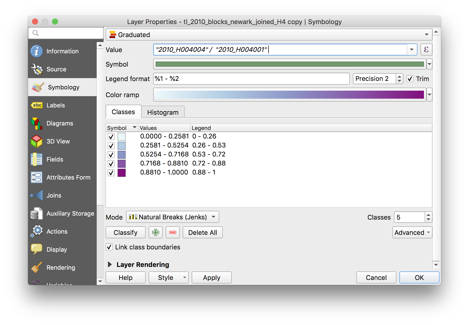
Click Apply to view the results on the map.
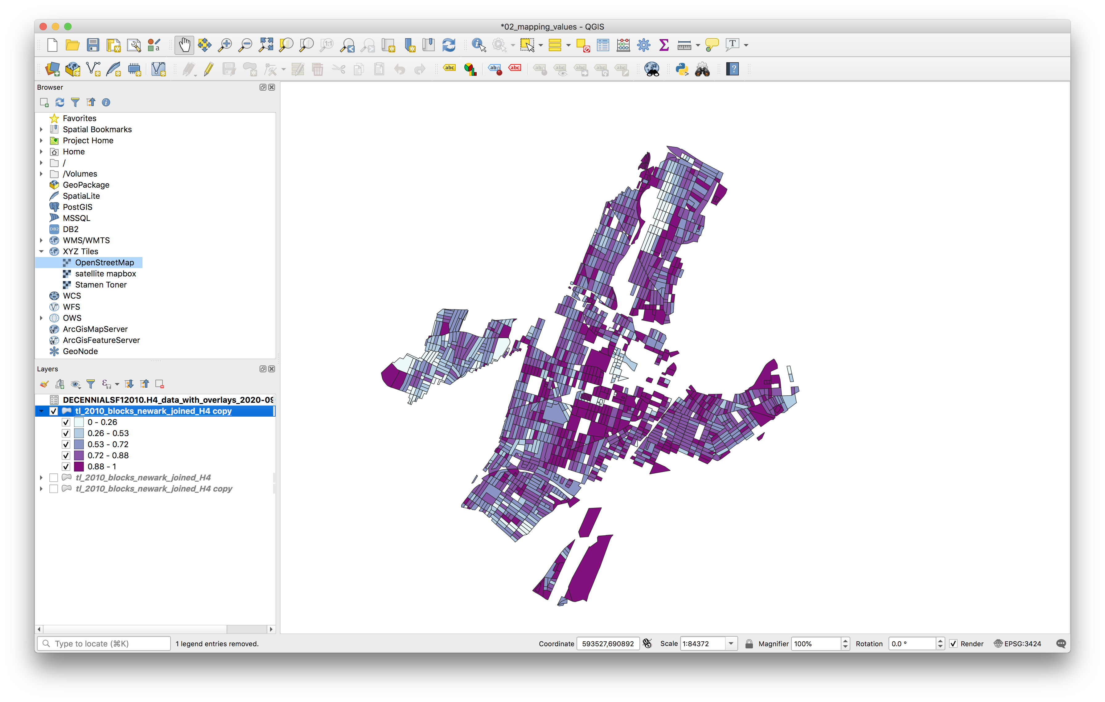
Bonus question: Why did parts of the map disappear? Submit this question and its answer with the .txt file for your assignment for additional points.
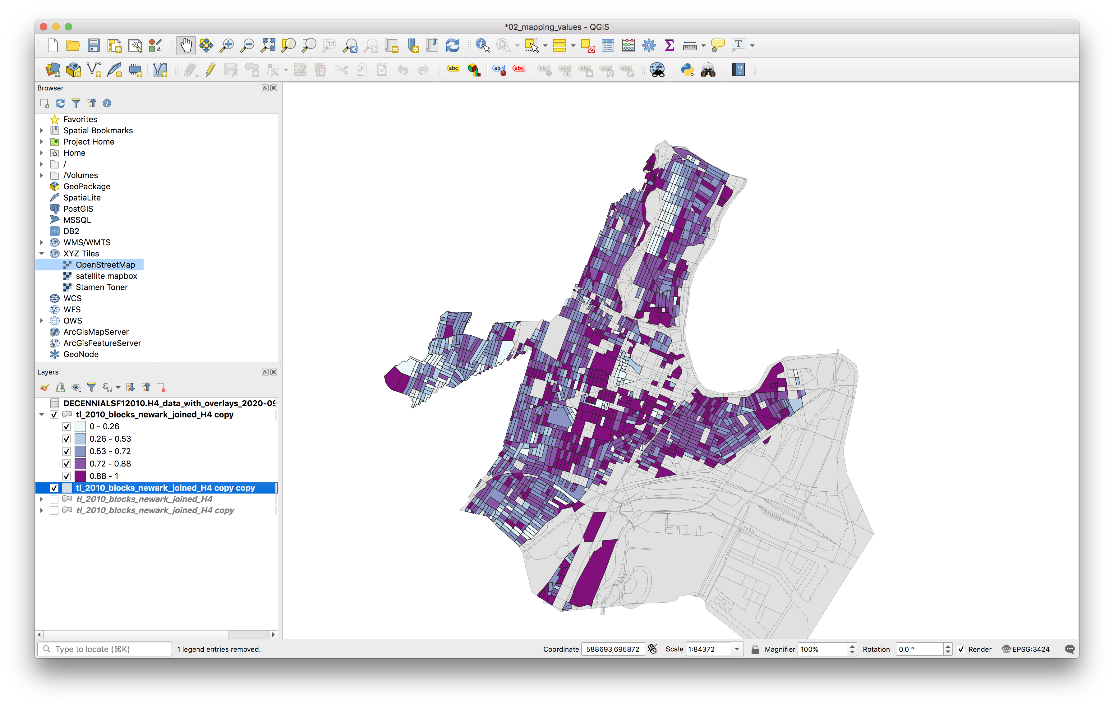
To fill in the areas which are now blank on your map where there are no rental housing units duplicate the Newark blocks layer again, place this duplicate layer below your current layer and symbolize it with a single symbol using a light grey fill.
Dot density map
Next we will create two different dot density maps showing rental housing units. Dot density maps are a way of symbolizing quantiative data in a manner that is unclassified in a dot density map dots are drawn within some geographic boundary, and each dot represents some number of a phenomena being visualized. For example rental housing units: you might have a dot density map where each dot represents one housing unit within a certain census block, or where one dot represents 50 housing units within a certain census block etc.
To create a dot density map in QGIS we will first create a new layer of dots within each census block. First we will create a dot density where each dot represents one rental housing unit.
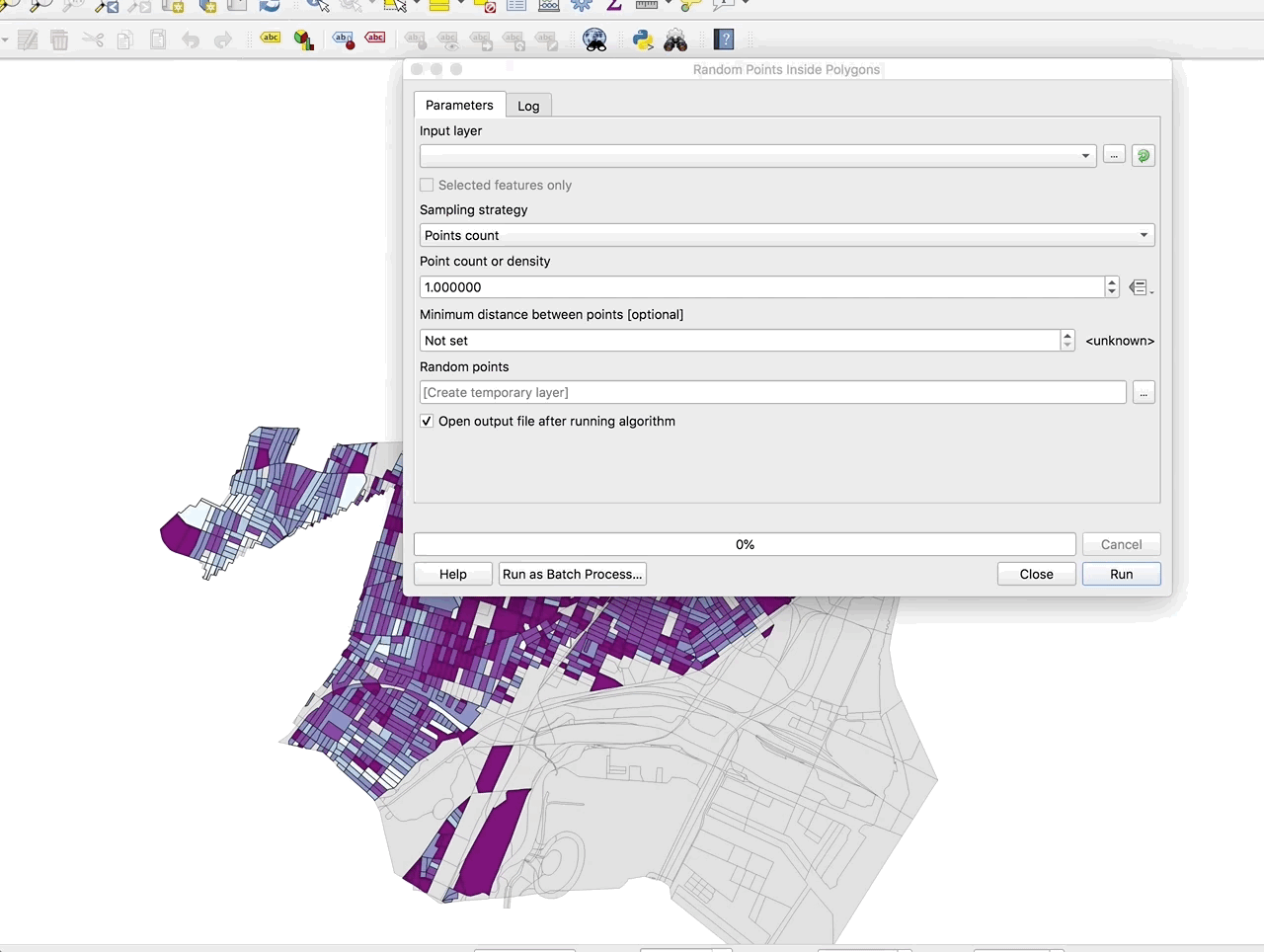
Select vector > research tools > random points inside polygons. In the menu that opens make the exact selections shown in the GIF:
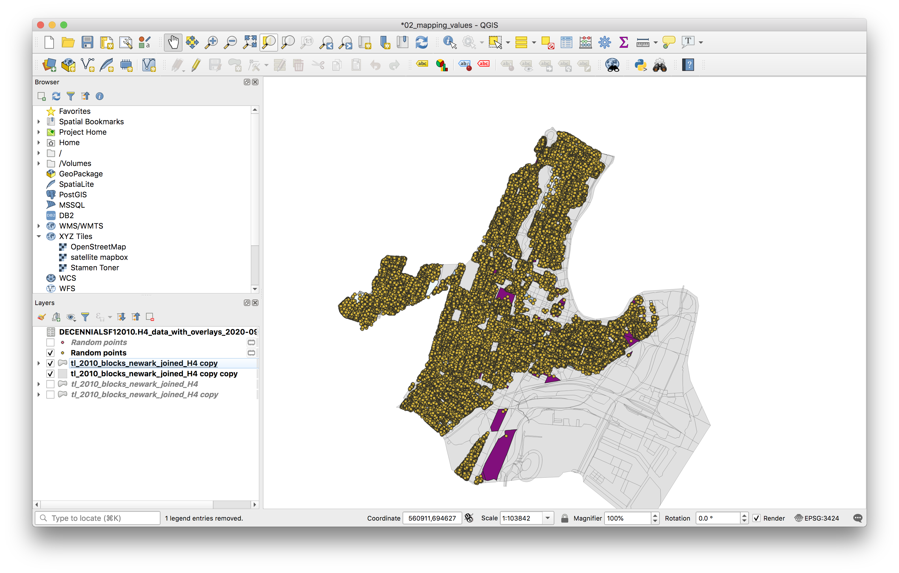
Once the tool runs your map will look something like this:
Save the temporary layer that was created for the dot density. First create a new folder within the data folder for this assignment called dot_density and save this layer as a geojson file: blocks_renters_dot_density.geojson. Be sure to select EPSG 3424 as the coordinate reference system.
Remove the temporary layer.
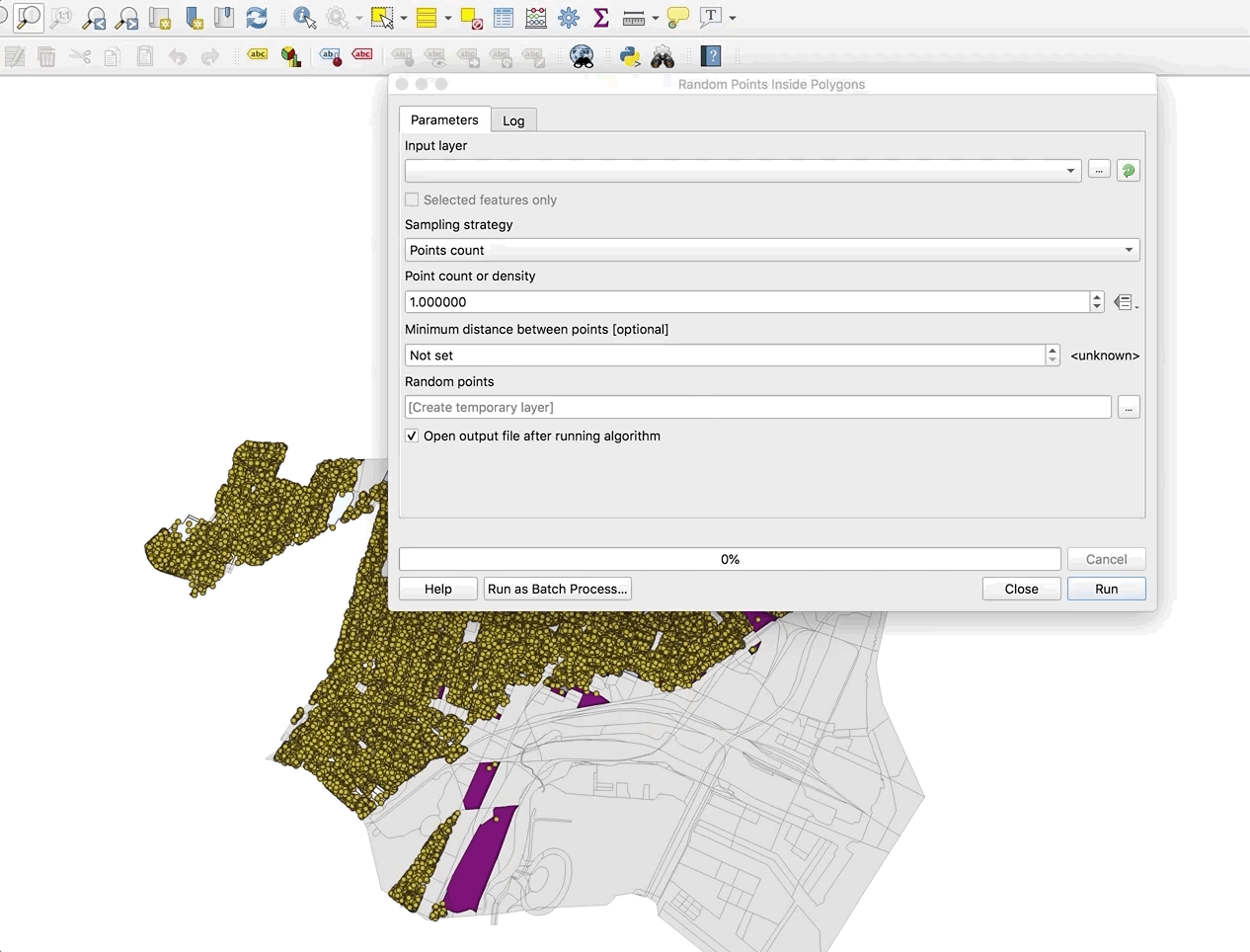
Create a second dot density map with a different value per dot. The process is the same as above except after selecting the field on which the number of dots is based you must select the Edit option and then use the Expression builder to specify the number of dots per housing unit. Do this by dividing the field containing the number of housing units by the value you would like. The gif example shows 50 housing units per dot.
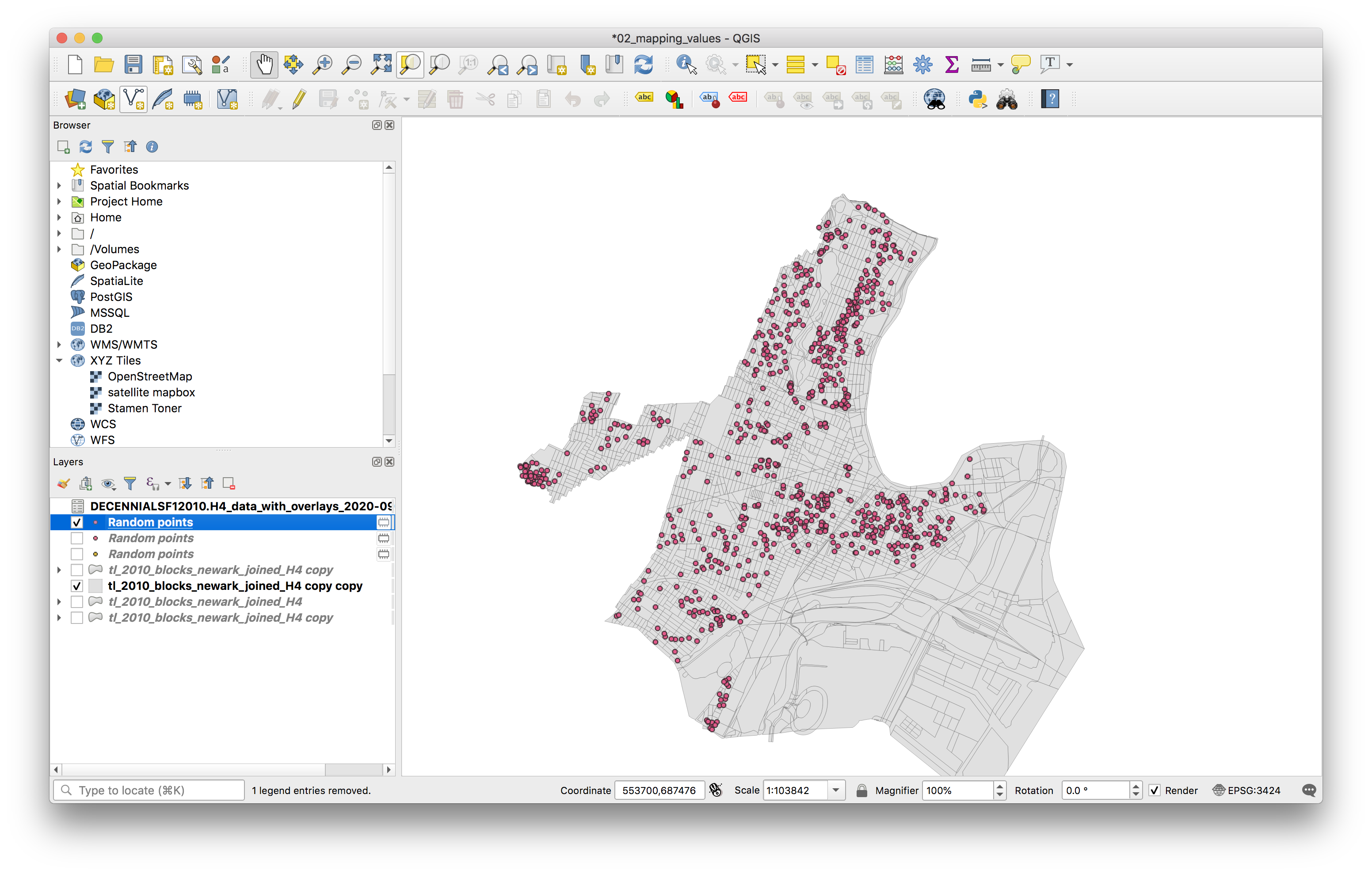
Test different values per dot until you find one that you think is legible. This is 50 housing units per dot:
Save that temporary layer as a new geojson file, be sure to include the value of rental housing units represented by each dot in the file name.
Remove the temporary layer.
Map composition
Use the QGIS layout tool and symbology menu to design three maps as outlined in the deliverables section above. Maps must include legends, scale bars, north arrows and a data source attribution.
Please take care with line weights and color choices. These should be designed maps with care and consideration for aesthetics.